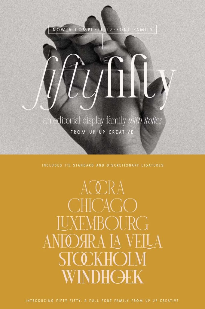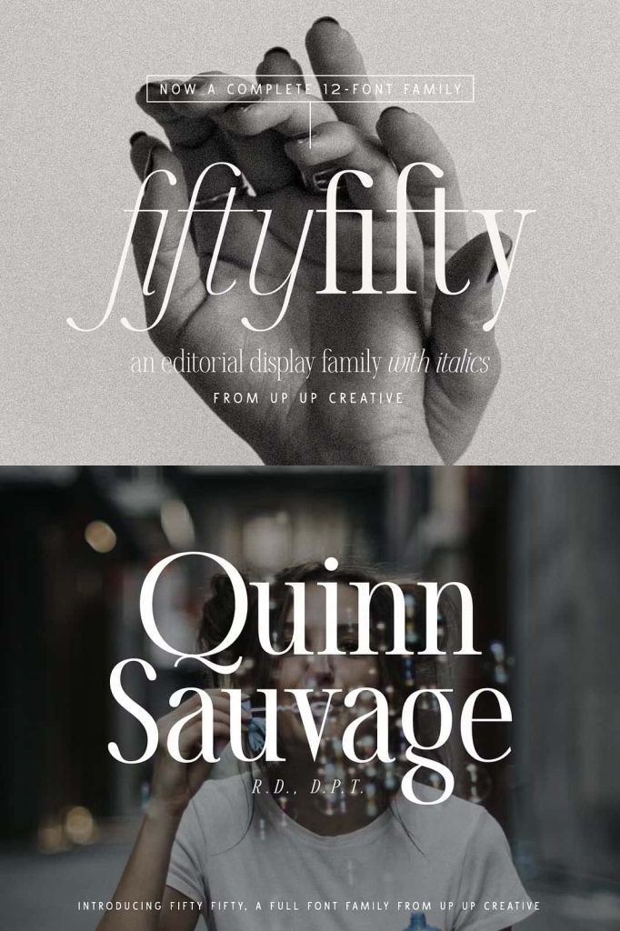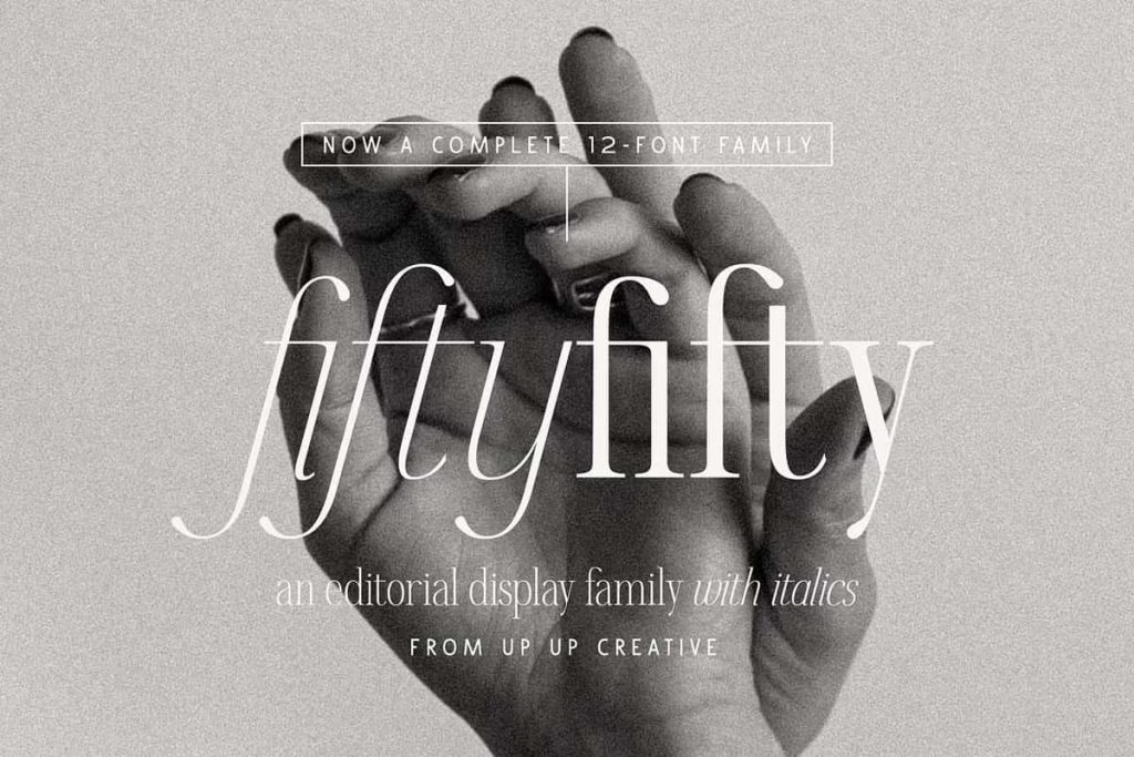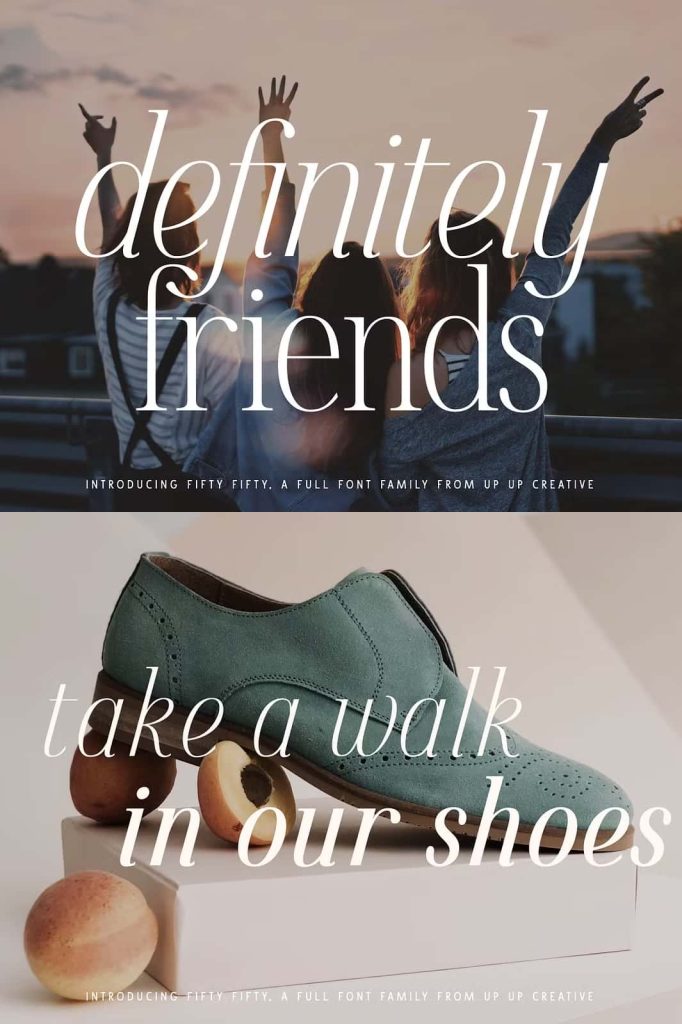
Fifty Fifty Editorial Serif Font Family: Elegant Versatility for Modern Typography
Fifty Fifty is an editorial serif font family that delivers a refined balance between classic elegance and contemporary design. Built with six distinct weights, each paired with a matching italic style, this typeface offers a complete system for designers who demand flexibility and visual consistency. It stands out with smooth curves, carefully crafted letterforms, and an extensive set of more than 100 ligatures that enhance both readability and artistic expression.
This font family adapts seamlessly to a wide range of creative projects. Whether designers focus on editorial layouts, branding, or display typography, Fifty Fifty provides the tools needed to create compelling and polished compositions. It transforms text into a visual statement while maintaining clarity and structure.
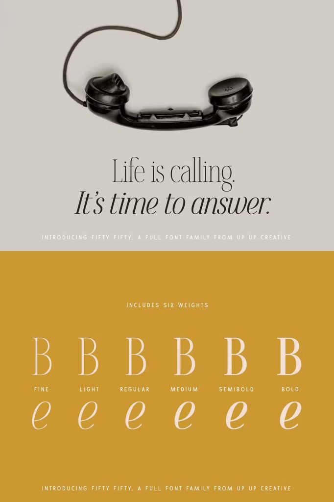
A Complete Typeface System with Six Weights and Italics
Fifty Fifty offers six carefully designed weights, allowing designers to build strong typographic hierarchies. Each weight works harmoniously with the others, making it easy to combine styles within a single project. The inclusion of matching italic versions adds another layer of flexibility, enabling more dynamic and expressive layouts.
Designers can use lighter weights for subtle elegance and heavier weights for bold emphasis. This range makes the typeface suitable for everything from delicate editorial text to powerful headlines. The italic styles introduce movement and contrast, helping to guide the reader’s attention across the page.
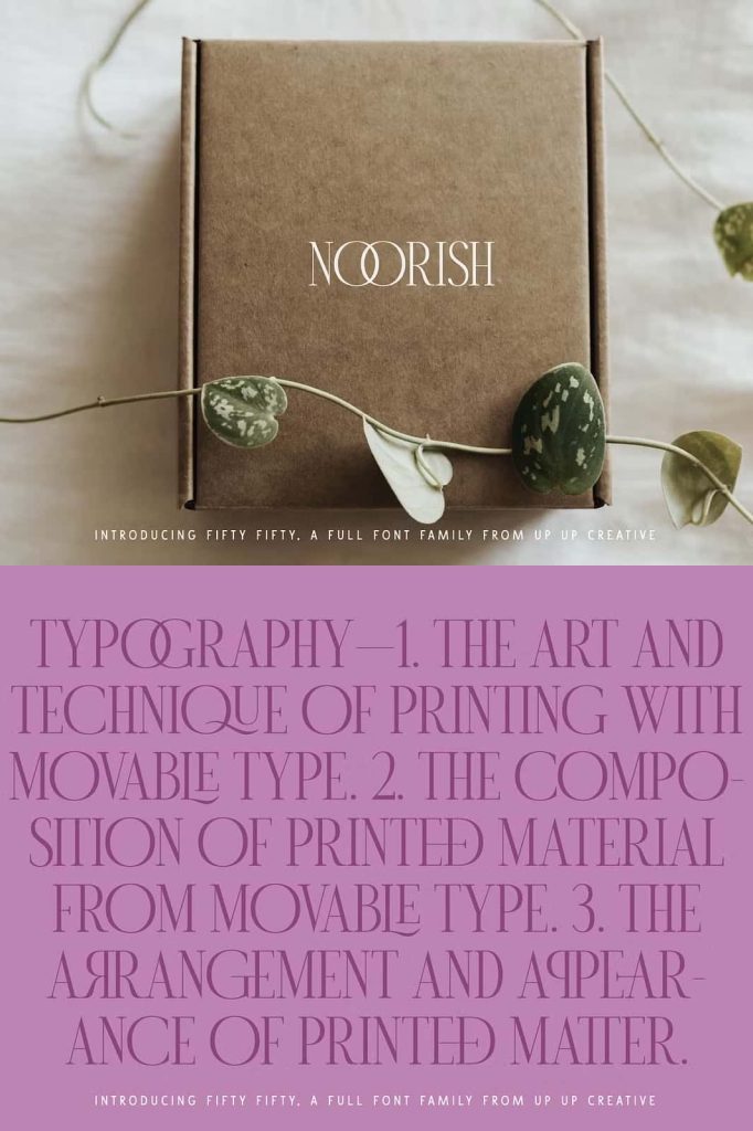
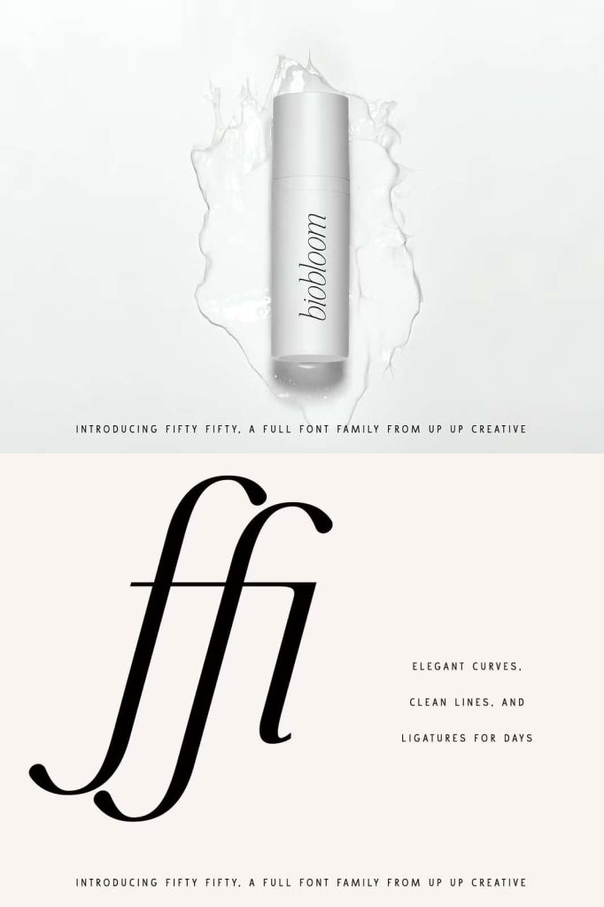
Over 100 Ligatures for Enhanced Typography
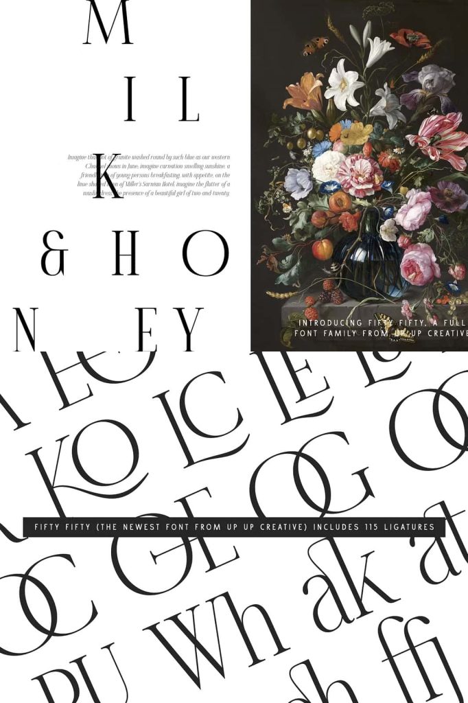
One of the defining features of Fifty Fifty is its extensive collection of ligatures. With more than 100 ligature combinations, the typeface allows designers to create unique and refined typographic details. These ligatures improve the flow between letters and add a distinctive touch to words and phrases.
Designers can use these features to craft elegant logos, stylish headlines, and sophisticated branding elements. The ligatures bring a sense of craftsmanship that elevates the overall design without overwhelming the content.
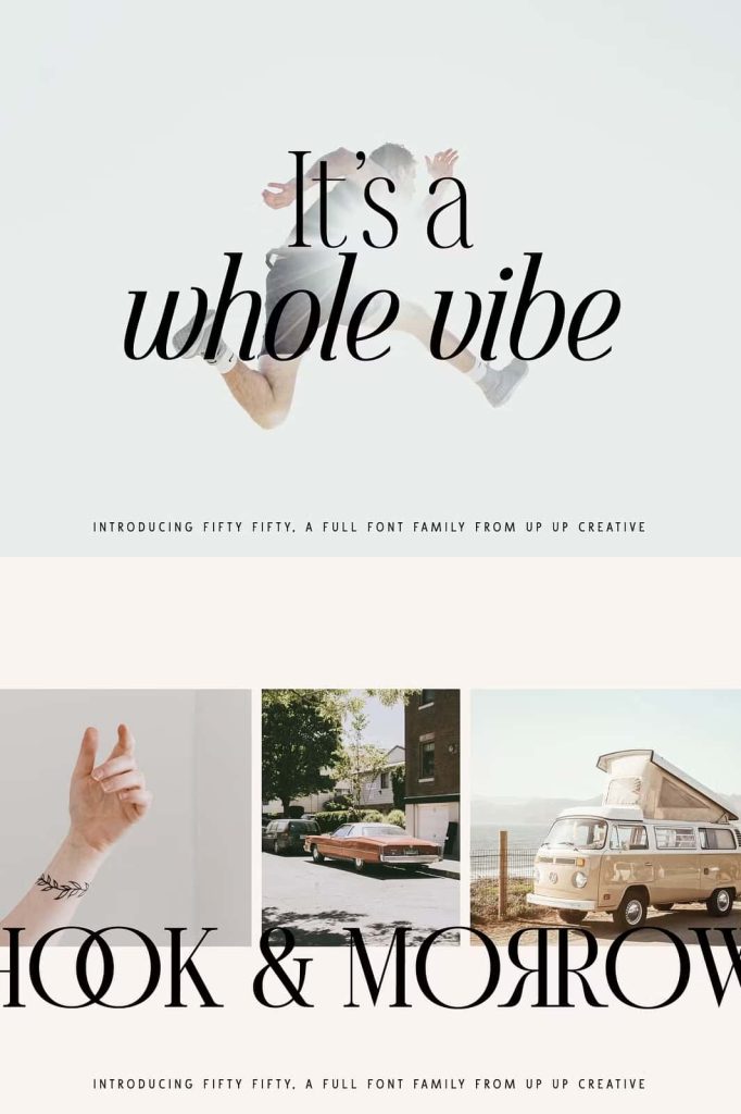
Striking Uppercase and Confident Lowercase Design
Fifty Fifty excels in uppercase settings, where its structure creates a bold and sophisticated presence. The capital letters feel strong, balanced, and visually impactful, making them ideal for headlines and display use. They command attention while maintaining a refined aesthetic.
At the same time, the lowercase characters hold their own with equal confidence. Their smooth curves and balanced proportions ensure readability and visual harmony. This balance between uppercase and lowercase forms allows designers to experiment freely without compromising consistency.
Smooth Curves and Refined Details
The typeface showcases smooth curves that give it a polished and elegant appearance. Each letterform has been carefully shaped to maintain consistency and flow across different weights and styles. These details contribute to a cohesive design system that performs reliably in various contexts.
The refined construction ensures that Fifty Fifty looks sharp in both large display sizes and smaller text applications. Designers can trust it to maintain clarity and beauty across different formats.
Ideal for Editorial Design and Branding
Fifty Fifty thrives in editorial environments where typography plays a central role. It enhances magazine layouts, articles, and publications by providing a clean yet expressive typographic voice. Its versatility allows designers to create layouts that feel both modern and timeless.
In branding projects, Fifty Fifty helps establish a strong and recognizable identity. Its elegant structure and customizable features make it suitable for logos, monograms, and visual identities. Brands can use it to communicate sophistication and professionalism while maintaining a unique character.
Perfect for Headlines, Logos, and Posters
Fifty Fifty performs exceptionally well in headlines, where its bold forms and refined details create a strong visual impact. It draws attention without sacrificing readability, making it ideal for both print and digital media.
For logos and monograms, the typeface offers a distinctive style that feels both classic and contemporary. The ligatures and balanced letterforms allow designers to create memorable brand marks. In poster design, Fifty Fifty provides the versatility needed to experiment with scale, contrast, and composition.
A Typeface Built for Creative Freedom
Fifty Fifty empowers designers to explore a wide range of creative possibilities. Its combination of weights, italics, and ligatures allows for endless variations in style and expression. Designers can use it to create everything from minimalist layouts to intricate typographic compositions.
This flexibility makes it a valuable addition to any design toolkit. It supports both structured and experimental approaches, giving designers the freedom to adapt it to their specific needs.
Conclusion
Fifty Fifty editorial serif font family combines elegance, versatility, and craftsmanship into a single, cohesive system. With six weights, matching italics, and over 100 ligatures, it provides designers with the tools needed to create sophisticated and impactful designs. Whether used for headlines, editorial layouts, branding, logos, or posters, Fifty Fifty delivers a refined and modern typographic experience.