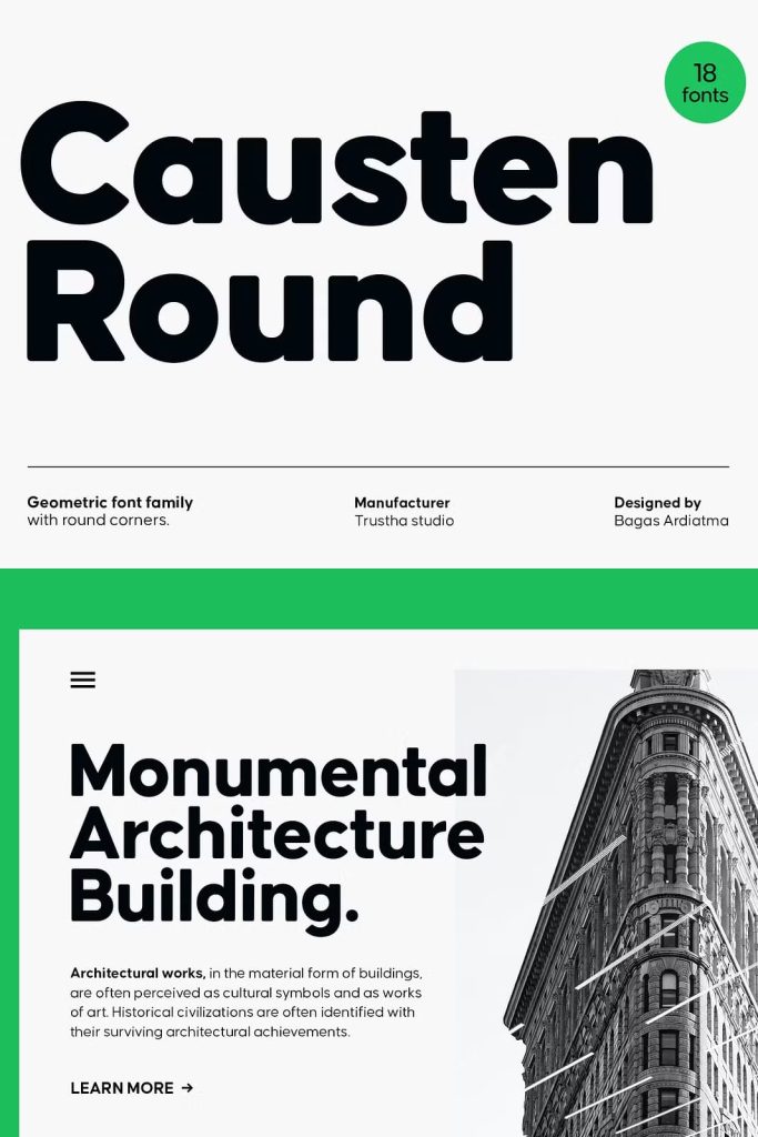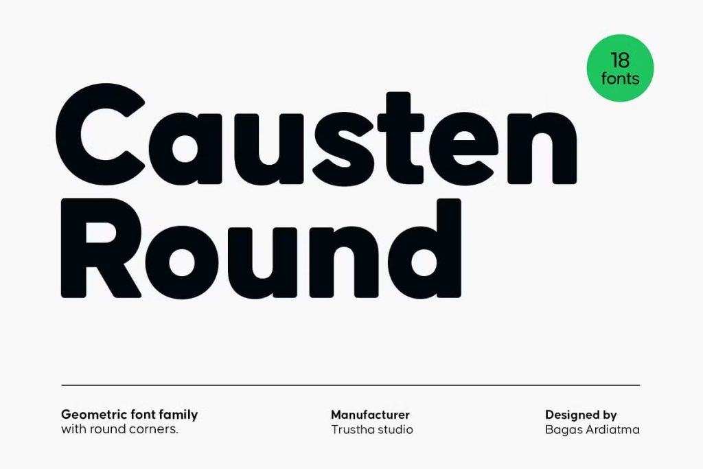
Causten Round Geometric Sans Serif: Clean Precision with Soft Rounded Character
Causten Round is a geometric sans serif font family that combines mathematical precision with subtle softness. It introduces rounded corners into a structured geometric framework, resulting in a typeface that feels both rational and approachable. Designers who value clarity, balance, and modern aesthetics will find Causten Round to be a reliable and versatile choice.
This typeface focuses on maintaining logical construction in every letterform. Each shape follows a deliberate design process that prioritizes consistency and visual harmony. The result is a font that delivers a clean, neat, and polished appearance across a wide range of applications.
Geometric Structure Built on Logical Design
Causten Round is rooted in geometric principles that ensure precision and uniformity. Each letterform is carefully constructed using consistent proportions and spacing. This approach creates a strong visual foundation that enhances readability and clarity.
The design emphasizes rationality, where every curve and line serves a purpose. Designers can rely on this structure to create layouts that feel organized and professional. The geometric nature of the font makes it particularly effective in modern and minimalist design environments.
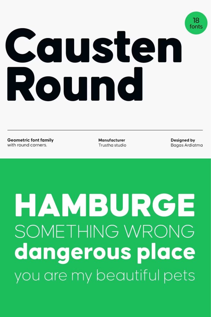
Consistency Across Every Letterform
The font maintains consistent proportions across all characters, ensuring a cohesive visual experience. This consistency allows designers to create seamless compositions without visual disruptions. It supports both small and large text applications with equal effectiveness.
By using a logical design approach, Causten Round ensures that each letter contributes to the overall harmony of the typeface.
Rounded Corners for a Softer Appearance
One of the defining features of Causten Round is its use of rounded corners. These subtle curves soften the rigid geometry of the font, creating a more approachable and friendly aesthetic. This balance between sharp structure and gentle curves makes the typeface adaptable to various design styles.
The rounded details reduce visual harshness while maintaining clarity. Designers can use this feature to create designs that feel modern yet welcoming.
Balancing Sharp Vision with Smooth Edges
The design process behind Causten Round involves careful observation and refinement. Each curve has been adjusted to maintain balance and proportion. This attention to detail ensures that the font remains visually appealing while preserving its geometric integrity.
Designers can use this balance to create compositions that feel both precise and inviting. It adds depth and character without compromising simplicity.
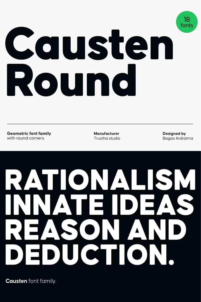
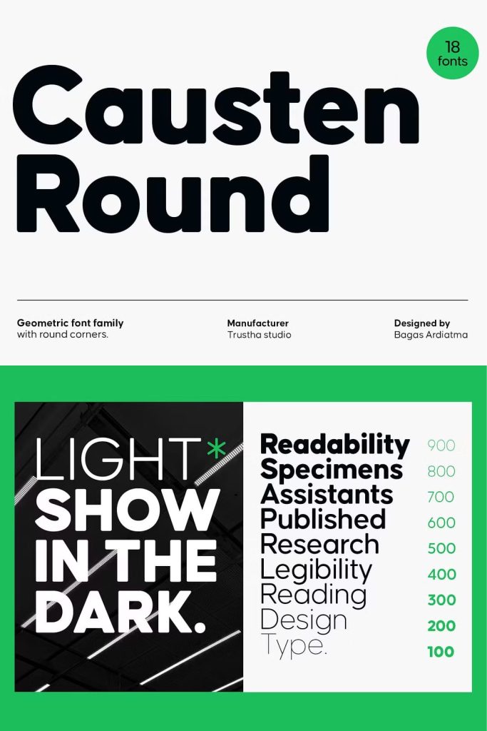
Clean, Neat, and Perfect Shapes
Causten Round delivers a clean and organized appearance that enhances readability and visual clarity. Its neat structure ensures that text remains easy to read, even in complex layouts. The font’s precise shapes contribute to a polished and professional look.
This quality makes it suitable for projects that require a high level of detail and consistency. Designers can use it to create layouts that feel structured and visually balanced.
Enhancing Readability and Visual Flow
The font’s clean design supports smooth reading by maintaining clear letterforms and consistent spacing. This improves the overall user experience, especially in digital environments. Designers can use it to guide the viewer’s eye through the content effectively.
The combination of geometric precision and rounded softness ensures that the text remains both functional and aesthetically pleasing.
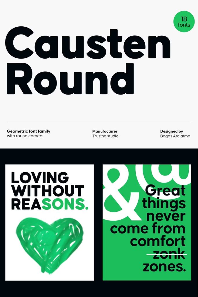
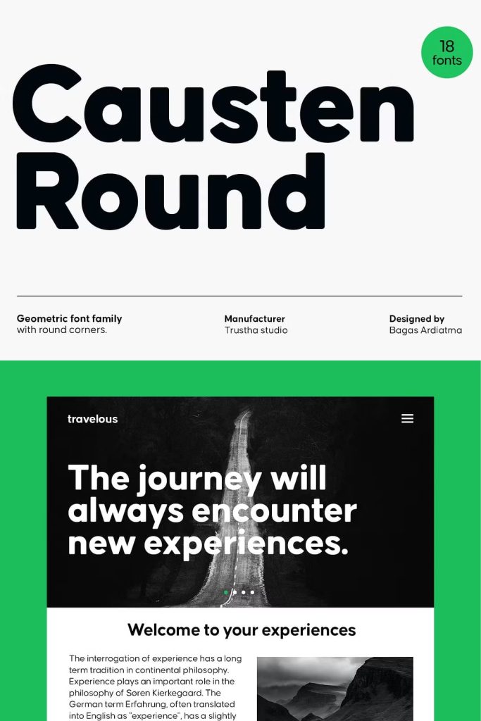
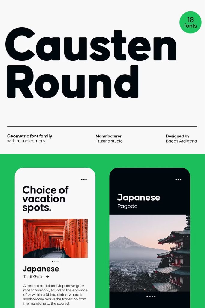
Versatility Across Modern Design Applications
Causten Round adapts easily to a wide range of design contexts. Its clean and modern aesthetic makes it suitable for branding, web design, editorial layouts, and corporate identity. Designers can use it to create visuals that feel contemporary and professional.
The font performs consistently across both digital and print platforms. It maintains its clarity and structure in various sizes and formats, ensuring reliable results in different design environments.
Ideal for Branding, UI Design, and Corporate Use
In branding, Causten Round helps establish a strong and consistent identity. Its geometric structure communicates professionalism, while its rounded corners add a touch of friendliness. This combination makes it suitable for a wide range of industries.
In user interface design, the font enhances readability and usability. Its clear letterforms ensure that information is easy to understand. For corporate applications, it provides a clean and organized appearance that reflects reliability and efficiency.
A Typeface That Combines Precision and Approachability
Causten Round stands out by blending strict geometric principles with subtle design nuances. It maintains a logical and structured approach while introducing elements that make it more human and accessible. This balance allows designers to create work that feels both professional and engaging.
The typeface supports a wide range of creative possibilities while maintaining a consistent visual language. It empowers designers to achieve clarity and sophistication in their work.
Conclusion
Causten Round geometric sans serif font offers a perfect combination of precision, balance, and softness. With its rounded corners, logical design, and clean structure, it provides a versatile solution for modern typography. Whether used in branding, web design, or corporate applications, Causten Round delivers a polished and contemporary typographic experience that enhances every project.