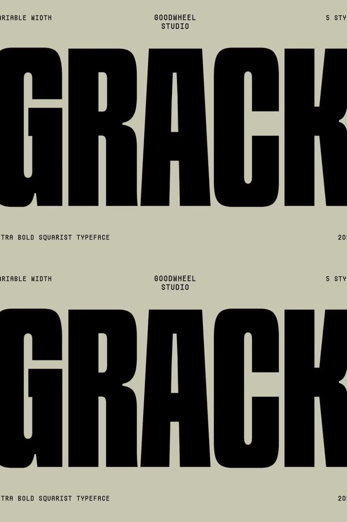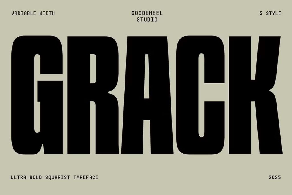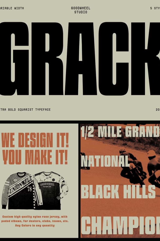
GW Grack Ultrabold Squarist Font: Strong Geometry Meets Modern Power
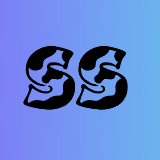
GW Grack ultrabold squarist font delivers a bold and commanding presence in modern typography. This typeface embraces strength through its thick strokes, rigid structure, and geometric precision. It creates a powerful visual identity that immediately captures attention and communicates confidence.
Designed with a focus on structure and impact, GW Grack transforms simple text into a dominant visual element. Its ultrabold appearance ensures that every word stands out clearly, making it an excellent choice for designers who want to create strong and memorable compositions.
Ultrabold Design That Demands Attention
GW Grack uses extremely thick letterforms to create a striking and unmistakable presence. Each character carries weight and authority, allowing your message to stand out even in crowded layouts. This boldness makes the font highly effective for headlines, titles, and branding elements.
The heavy strokes also enhance visibility across different platforms. Whether used in print or digital media, the font maintains its clarity and impact. Designers can rely on GW Grack to deliver consistent results in high-visibility applications.
Create Strong Visual Hierarchy
The ultrabold style of GW Grack helps establish clear hierarchy within your design. It allows you to highlight key information and guide the viewer’s attention effectively. This makes it ideal for posters, advertisements, and user interfaces where emphasis is essential.
By using this font strategically, you can create layouts that feel organized and visually engaging. It ensures that important messages do not get lost in the design.
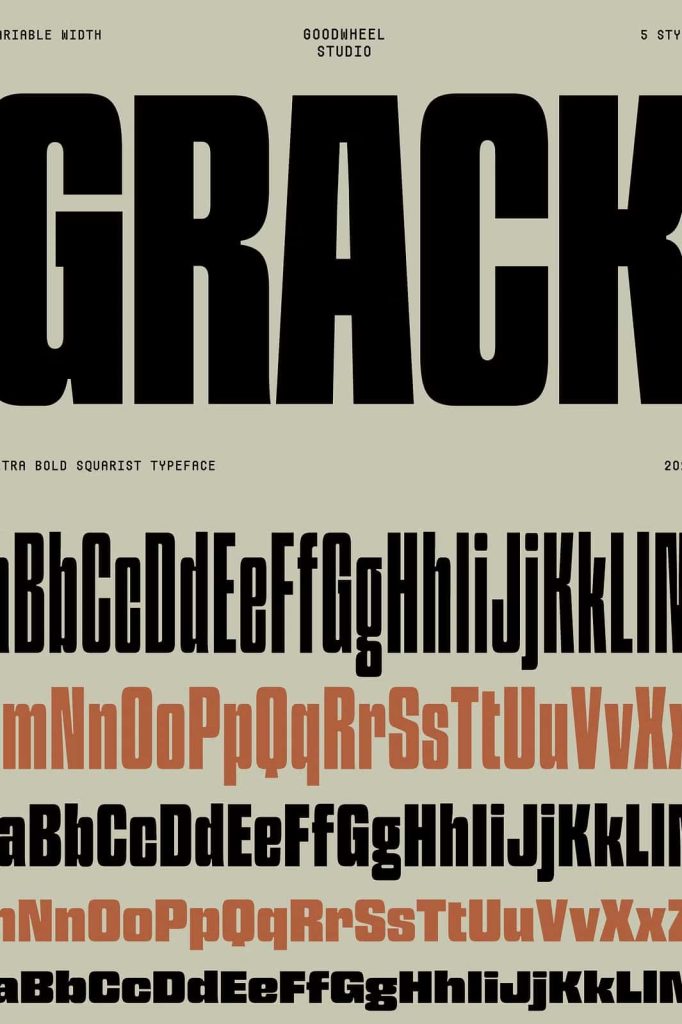
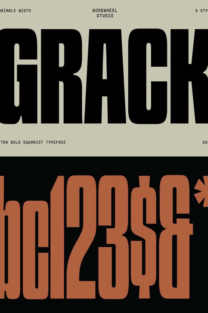
Squarist Geometry for a Modern Look
GW Grack features a squarist design approach that emphasizes geometric shapes and rigid forms. The letterforms rely on straight lines and sharp angles, creating a clean and structured appearance. This geometric foundation gives the font a modern and industrial feel.
The consistency of shapes across characters enhances visual harmony. It allows the font to maintain a cohesive look, even when used in complex layouts. This makes it suitable for contemporary design projects that require precision and clarity.
Achieve Clean and Structured Typography
The geometric nature of GW Grack supports clean and organized design. It reduces visual noise and ensures that text remains easy to read despite its bold style. Designers can use this quality to create layouts that feel both strong and controlled.
This structured approach also aligns well with modern design trends, making the font relevant and versatile.
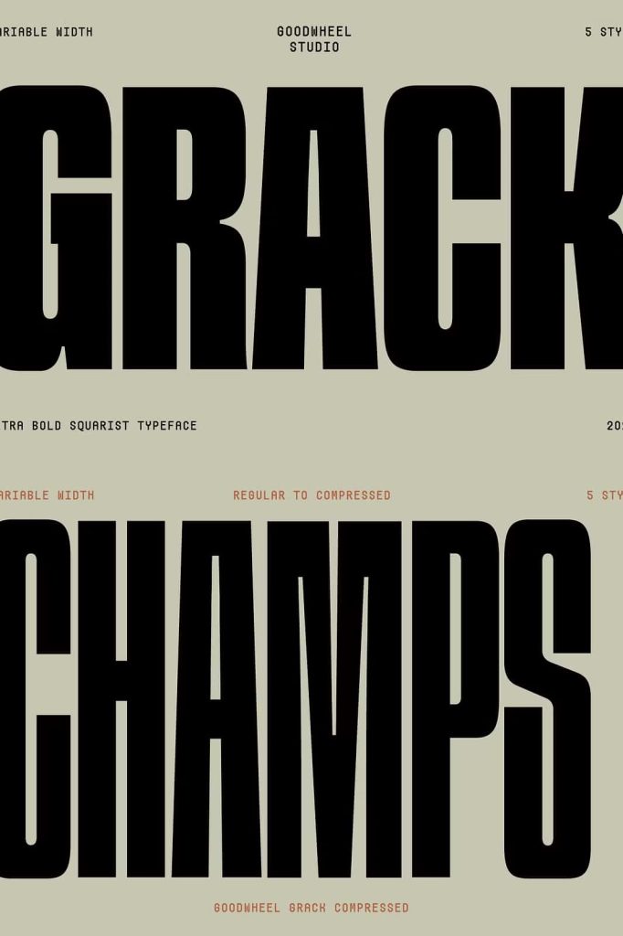
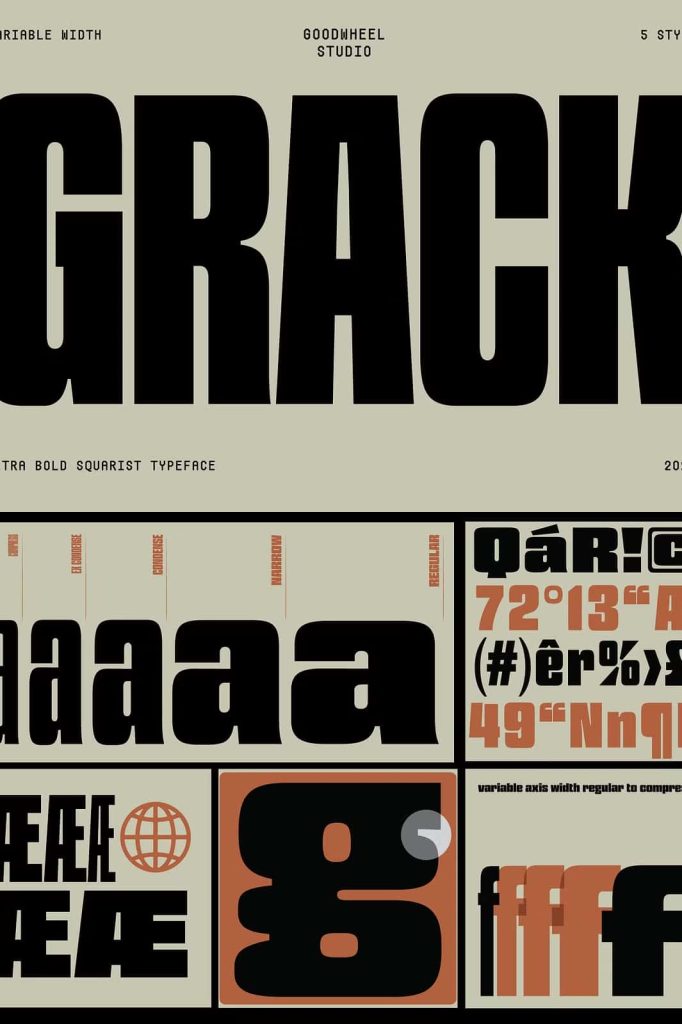
Variable Width for Flexible Design
One of the standout features of GW Grack is its variable width capability. The font can compress from ultrabold to more regular proportions, giving designers greater control over spacing and layout. This flexibility allows you to adapt the font to different design needs without losing its core identity.
Variable width enhances usability across various formats. It helps you fit text into tight spaces or expand it for more dramatic compositions. This adaptability makes GW Grack a practical choice for dynamic design environments.
Customize Layouts with Precision
With adjustable width, you can fine-tune your typography to match your design goals. This feature supports creative experimentation while maintaining consistency. It allows you to achieve balanced compositions without compromising readability.
Designers can use this flexibility to create unique visual effects and optimize space usage in their layouts.
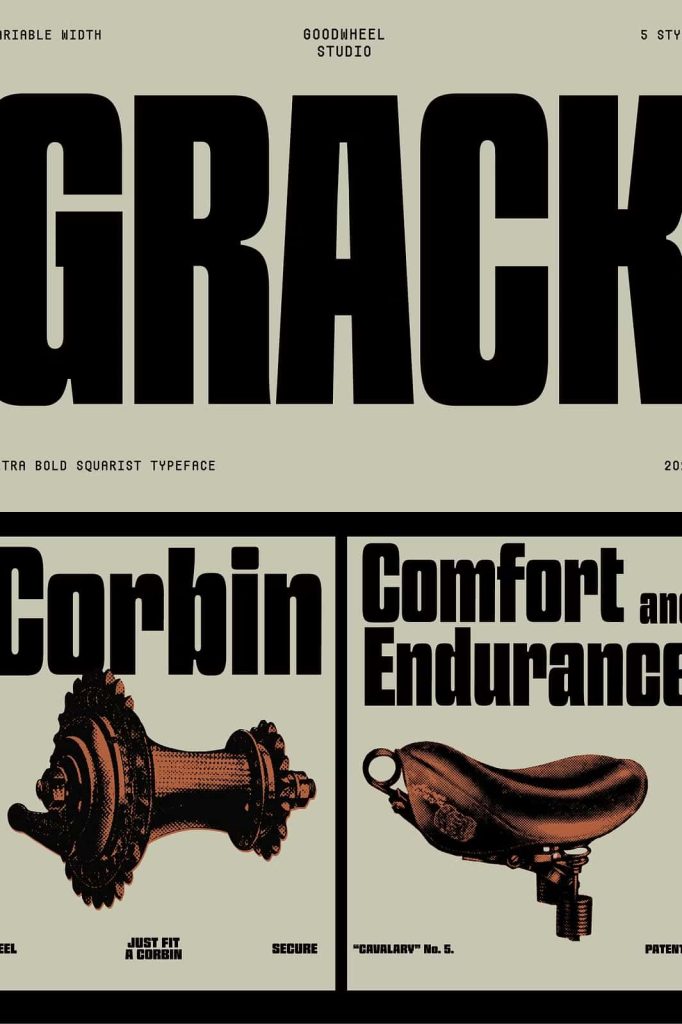
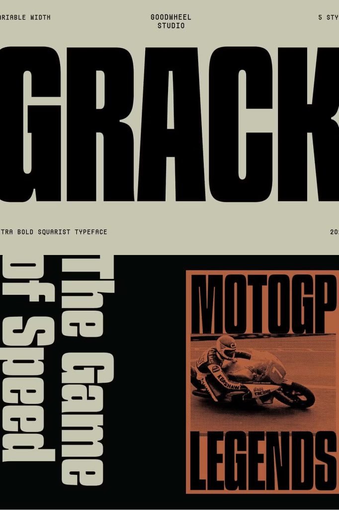
Perfect for Bold Branding and Display Use
GW Grack excels in branding and display applications. Its strong personality makes it ideal for logos, headlines, posters, and promotional materials. The font helps brands communicate confidence, innovation, and modernity.
Because of its distinctive style, GW Grack works best in short text and large formats. It ensures that your message remains clear and impactful without overwhelming the viewer.
Build a Memorable Visual Identity
Using GW Grack, designers can create branding that stands out and remains memorable. The font’s bold geometry and heavy weight contribute to a unique and recognizable look. This helps brands establish a strong presence in competitive markets.
Its consistency across different applications also supports cohesive branding strategies.
Versatile Across Digital and Print Media
GW Grack performs effectively across multiple platforms. Its bold design ensures visibility on screens, while its geometric precision maintains clarity in print. This versatility makes it a reliable choice for designers working in diverse environments.
From website headers to large-scale posters, the font adapts seamlessly to different contexts. It maintains its visual strength and readability regardless of size or medium.
Maintain Consistency Across Platforms
The consistent structure of GW Grack helps unify your design across various formats. It ensures that your typography remains cohesive, whether used in digital interfaces or printed materials.
This reliability allows designers to focus on creativity while trusting the font to perform effectively.
Why Choose GW Grack Ultrabold Squarist Font?
GW Grack ultrabold squarist font offers a powerful combination of boldness, geometry, and flexibility. Its thick strokes, structured design, and variable width features make it a valuable tool for modern typography.
By choosing GW Grack, you gain a typeface that enhances visual impact and supports creative exploration. It allows you to create designs that feel strong, contemporary, and visually compelling. For designers who want to make a bold statement, GW Grack delivers exceptional performance and style.