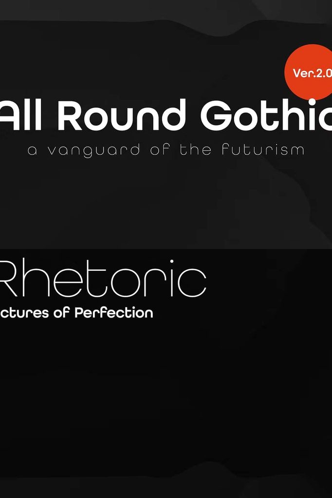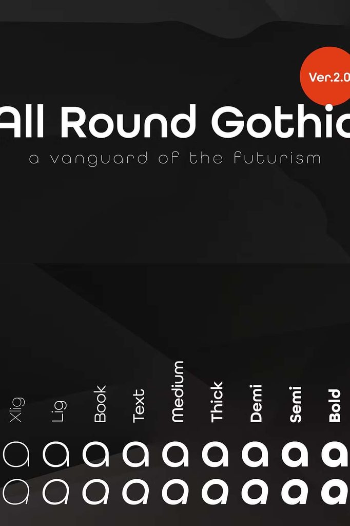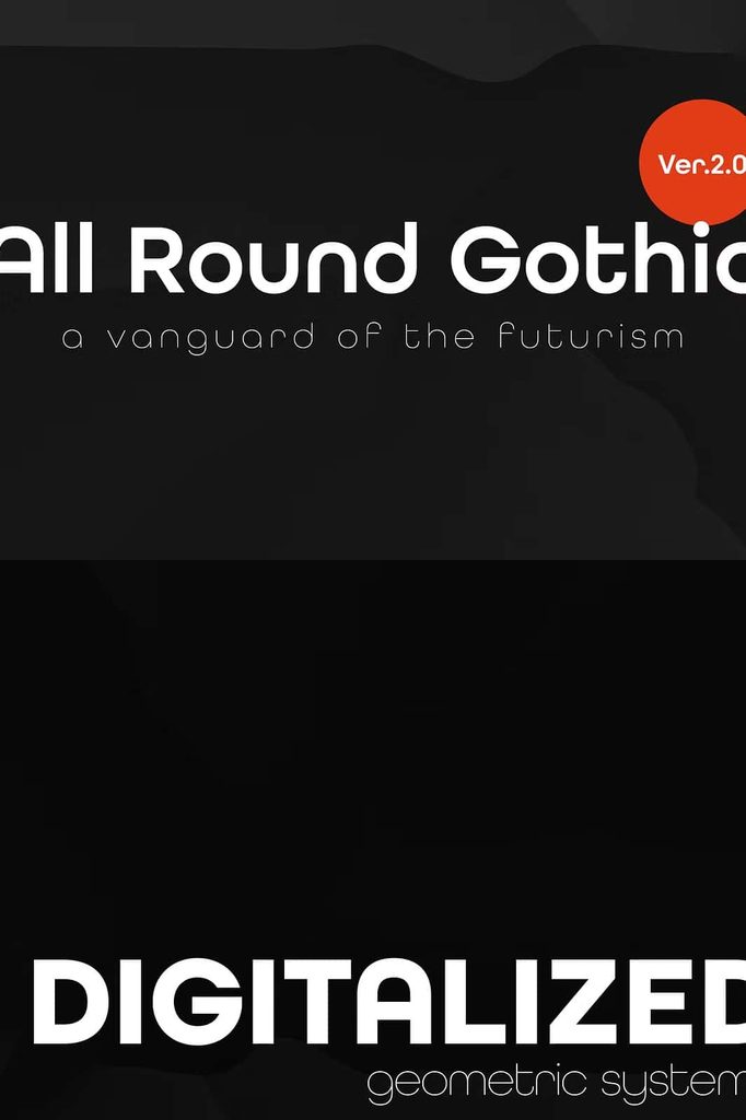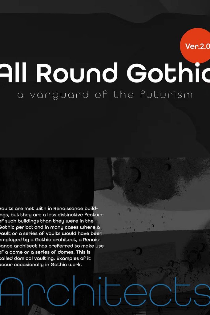

All Round Gothic Font
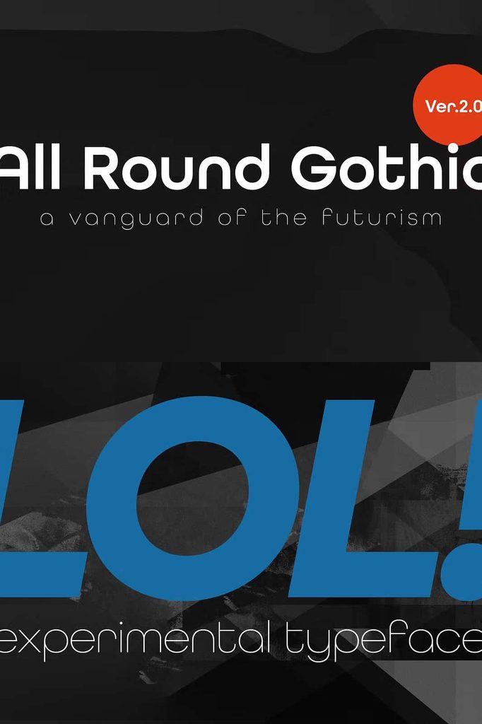
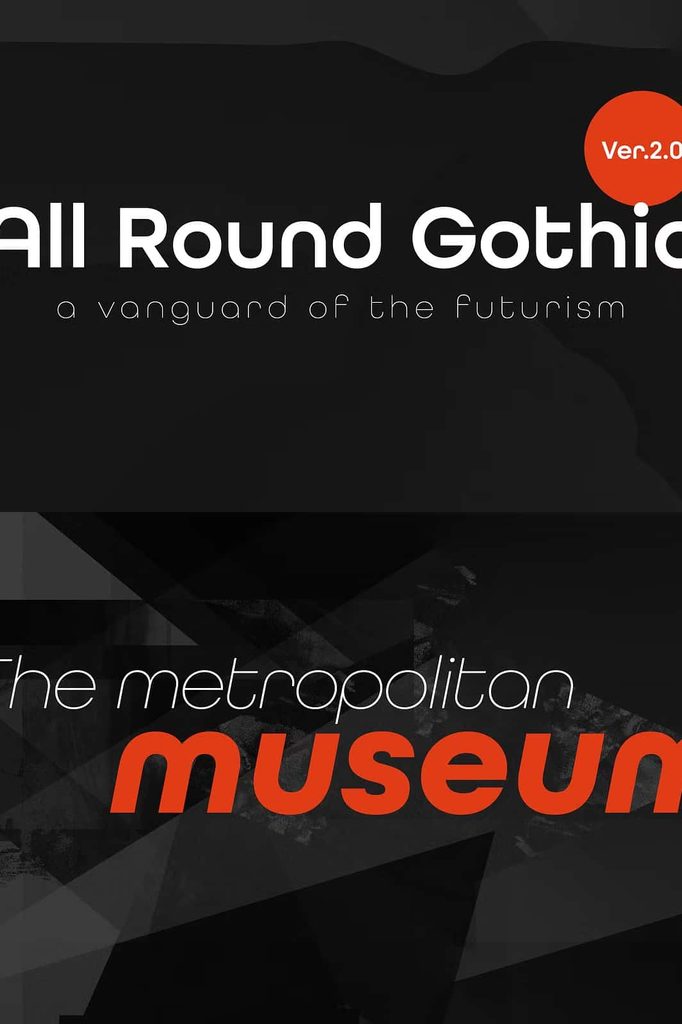
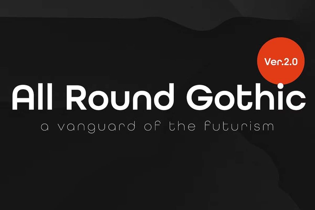
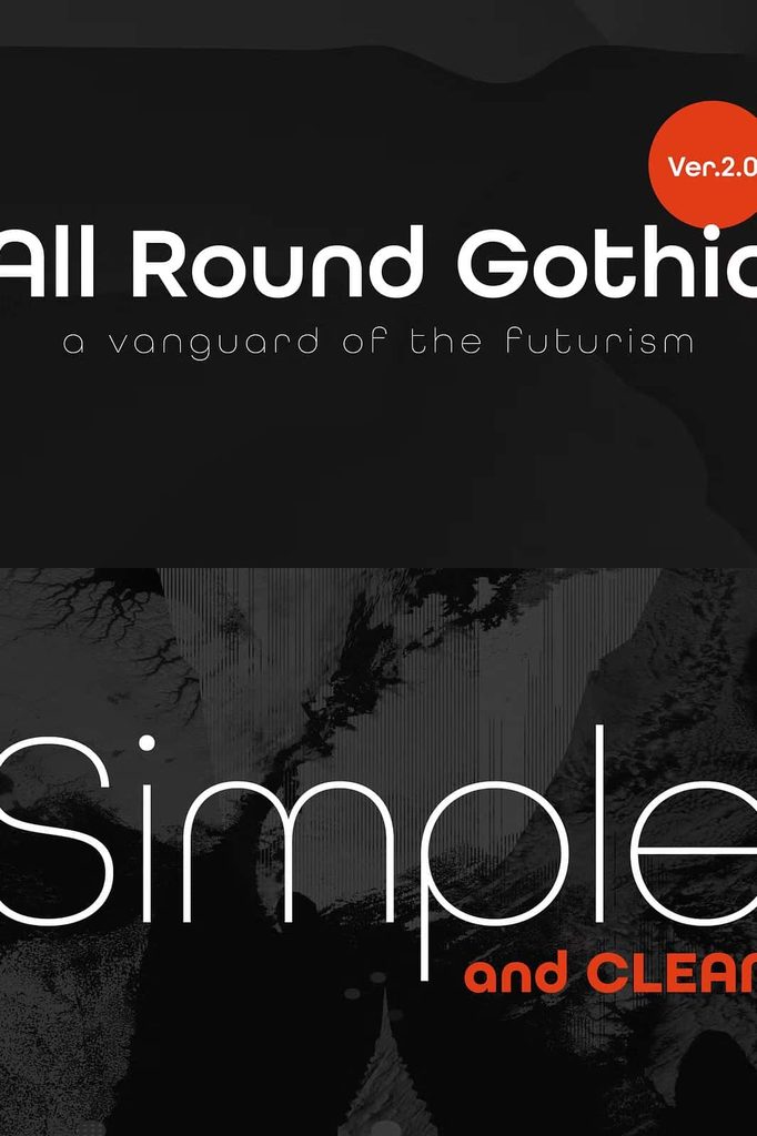
All Round Gothic is a distinctive geometric sans-serif font family originally designed in 2012 by Ryoichi Tsunekawa. Drawing inspiration from influential typefaces such as Avant Garde Gothic and Futura, the font combines structured geometric forms with a softer and more approachable personality. This thoughtful balance allows All Round Gothic to deliver a clean modern appearance while maintaining a friendly and organic character.
Although the typeface builds its foundation on geometric principles, it avoids the rigid appearance that often comes with highly structured sans-serif fonts. Its carefully modified shapes and subtle imperfections create a warmer visual impression. As a result, All Round Gothic can move comfortably between classic modernist design and contemporary creative projects.
All Round Gothic Font Features
All Round Gothic combines geometric construction with soft, approachable details. The typeface takes recognizable characteristics from early modernist sans-serif design and reshapes them to create something more contemporary. Its clean forms provide strong readability, while its rounded and slightly organic details add personality.
This combination makes All Round Gothic a versatile choice for designers who need a typeface that feels modern without becoming overly mechanical. You can use it to establish a polished visual identity while still maintaining a sense of warmth and accessibility.
Geometric Sans-Serif Structure
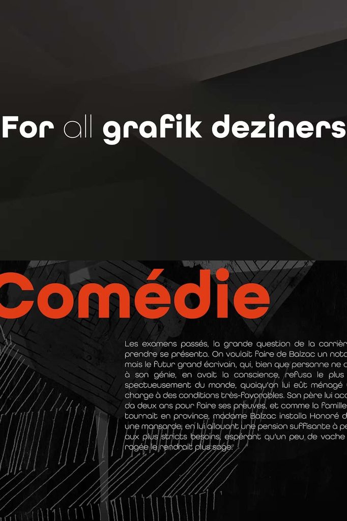
All Round Gothic uses geometric principles to construct its characters. The resulting letterforms create a consistent and organized appearance that works effectively across headings, branding, editorial layouts, packaging, and digital interfaces. Its structured design gives compositions a clear visual foundation and helps typography maintain a professional appearance.
Soft and Friendly Character
Unlike purely geometric typefaces, All Round Gothic introduces softer details throughout its letterforms. These changes give the font a friendlier personality and make it feel less rigid. The result is typography that can communicate modernity while remaining approachable and inviting.
Inspired by Avant Garde Gothic and Futura
All Round Gothic takes inspiration from two important geometric sans-serif classics: Avant Garde Gothic and Futura. Both typefaces have played an influential role in modern graphic design, particularly through their emphasis on geometric construction and clean visual forms.
All Round Gothic builds upon this tradition while introducing its own interpretation. Rather than simply reproducing the appearance of classic geometric fonts, it softens the structure and incorporates more organic characteristics. This approach gives designers a typeface that connects historical modernism with contemporary visual communication.
Organic Details Within Geometric Forms
One of the defining characteristics of All Round Gothic is its approach to geometric shapes. The design eliminates unnecessary stems and uses imperfectly circular bowls to create a subtle organic quality. These decisions prevent the letterforms from appearing excessively mechanical.
The imperfect circular forms introduce small visual variations that make the typography feel more natural. At the same time, the underlying geometric structure keeps the overall design controlled and cohesive. This balance gives All Round Gothic its distinctive identity.
A Balance Between Precision and Imperfection
All Round Gothic demonstrates how designers can combine precision with controlled imperfection. The font retains the clarity and order associated with geometric sans-serif typography while introducing small deviations that make the characters feel more human.
This balance can help designers create compositions that appear polished without feeling cold. It works particularly well for brands and creative projects that want to communicate innovation, simplicity, and friendliness at the same time.
Connecting Modernist and Contemporary Design
All Round Gothic creates a visual connection between the modernist design language of the 1920s and contemporary typography. Its geometric foundation recalls the ideals of early modernist design, while its softened forms respond to current preferences for more approachable and human-centered visual communication.
This combination gives the typeface a timeless quality. It can reference classic graphic design without making a project look outdated. At the same time, its contemporary interpretation allows it to integrate naturally into modern branding, digital design, advertising, and editorial work.
All Round Gothic for Branding
All Round Gothic can provide a strong foundation for brand identities that need to appear modern, clean, and approachable. Its geometric structure creates consistency across wordmarks and supporting typography, while its rounded characteristics add personality.
Designers can use the font for logos, wordmarks, packaging, business cards, websites, advertising materials, and brand guidelines. Its distinctive appearance can help a brand establish recognition while avoiding the overly technical feel associated with some geometric sans-serif typefaces.
All Round Gothic for Digital Design
The font also suits contemporary digital projects. Its clean sans-serif construction can support website headings, application interfaces, digital campaigns, social media graphics, and online publications. The friendly personality makes it particularly useful for digital brands that want to communicate clearly without appearing overly corporate.
Use All Round Gothic for prominent headings, navigation elements, promotional messages, and other display applications where its geometric character can make a noticeable contribution to the overall design. Pair it with a complementary typeface when you need additional contrast for longer text.
Creative Uses for All Round Gothic Font
The versatility of All Round Gothic allows designers to apply it across many creative fields. Its combination of geometric structure and organic details makes it suitable for projects that require both visual discipline and personality.
- Logo and wordmark design
- Modern brand identities
- Website and digital design
- Mobile and application interfaces
- Editorial layouts
- Magazine headlines
- Poster and advertising design
- Product packaging
- Social media graphics
- Corporate and creative presentations
- Signage and display typography
- Editorial and publication design
- Fashion and lifestyle branding
- Contemporary marketing materials
A Versatile Typeface for Contemporary Projects
All Round Gothic works well when a project requires typography that can adapt to different visual directions. Its geometric foundation provides a consistent structure, while its softer details allow designers to create a more relaxed and welcoming atmosphere.
You can use the font in minimalist compositions, colorful campaigns, sophisticated branding systems, or playful creative layouts. Its ability to move between these different environments makes it a practical choice for designers who want one typeface to support a broad range of applications.
Why Choose All Round Gothic Font?
All Round Gothic offers a distinctive alternative to traditional geometric sans-serif fonts. It retains the recognizable structure of classic modernist typography but introduces softer shapes and organic imperfections. This approach creates a balance between precision and personality.
The font can help designers communicate a contemporary aesthetic without sacrificing warmth. Its connection to influential typefaces such as Avant Garde Gothic and Futura also gives it a strong historical foundation, while its modified forms keep the overall appearance fresh and relevant.
For branding, digital design, editorial projects, advertising, and packaging, All Round Gothic provides a flexible typographic system that can support both professional and creative visual identities.
Conclusion
All Round Gothic is a geometric sans-serif font family that successfully combines classic modernist principles with a softer contemporary personality. Originally designed in 2012 by Ryoichi Tsunekawa, the typeface draws inspiration from Avant Garde Gothic and Futura while developing its own distinctive visual language.
Its geometric construction provides clarity and structure, while imperfectly circular bowls, simplified forms, and other subtle adjustments create a more organic and friendly appearance. This combination helps All Round Gothic bridge the gap between historical modernism and contemporary design.
Whether you need typography for branding, websites, packaging, editorial layouts, posters, advertising, or digital content, All Round Gothic offers a versatile solution. Its timeless foundation and approachable character make it a strong choice for designers who want clean geometric typography with a human touch.