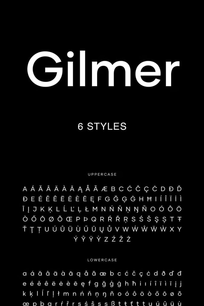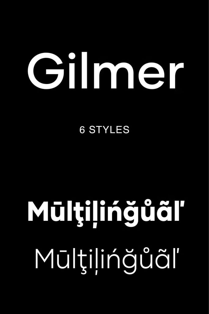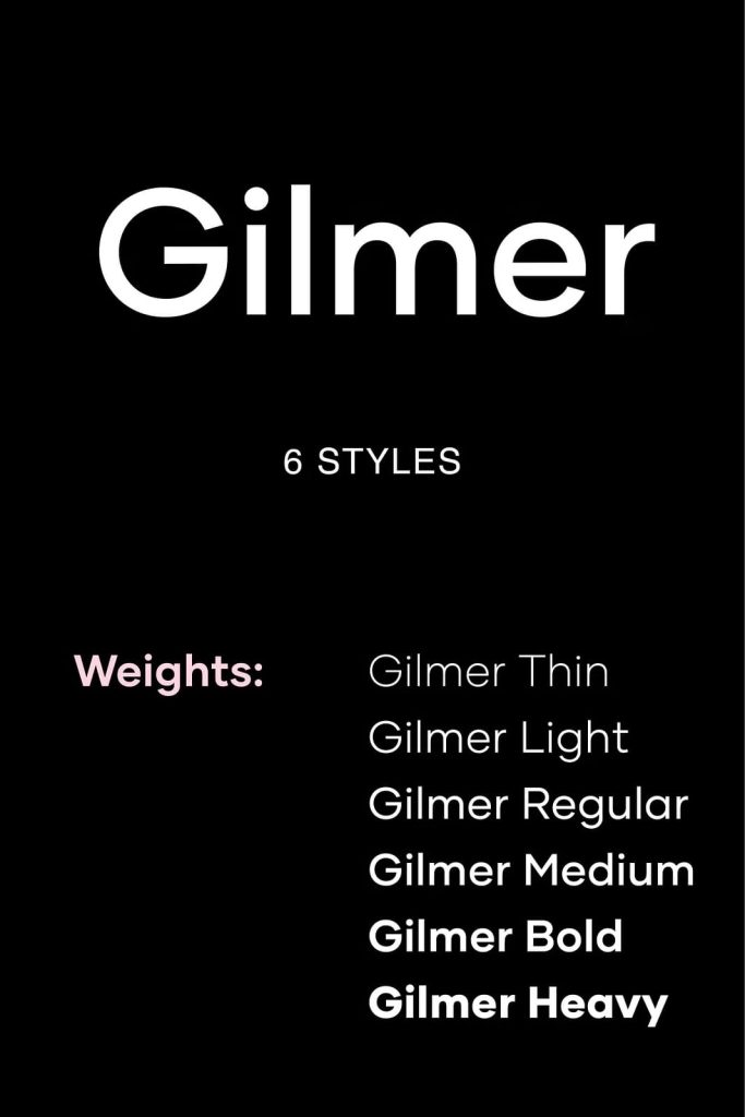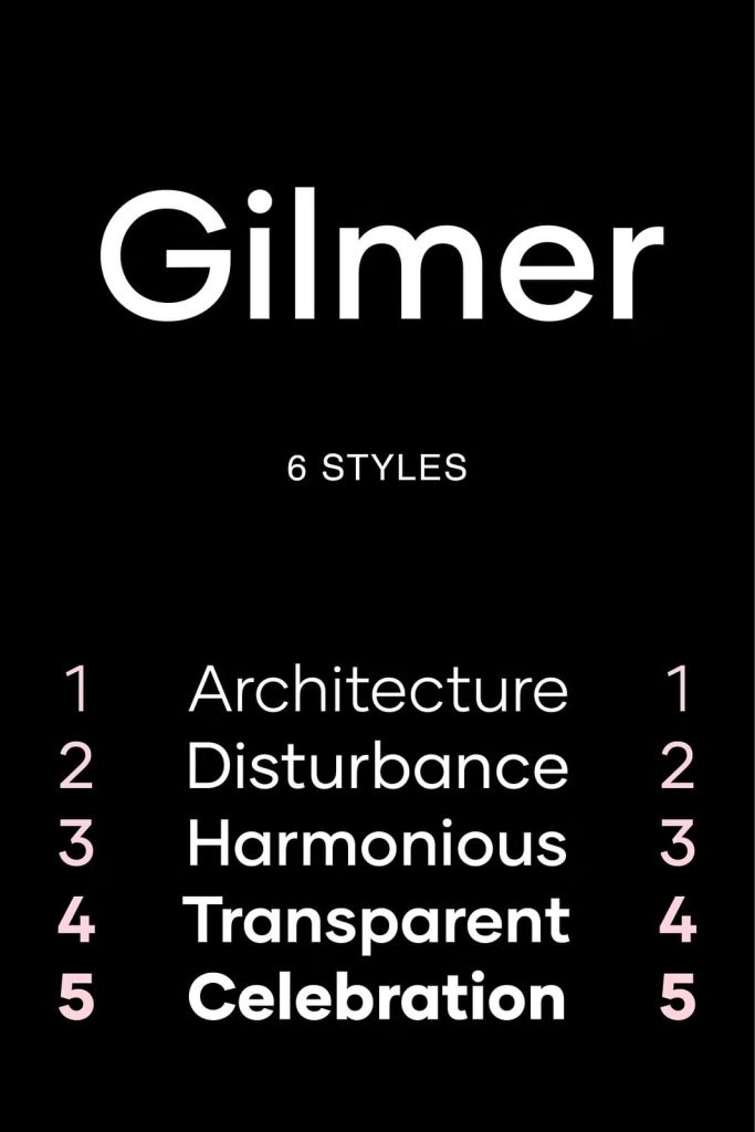
Gilmer Font Family: A Modern Geometric Sans Serif for Versatile Design
Gilmer is a fresh and contemporary geometric sans serif font family that brings clarity, precision, and modern style into any design project. Inspired by iconic typefaces such as Futura and Avant Garde, Gilmer captures the essence of classic geometric typography while refining it for today’s creative demands. Designers can use this typeface to create clean, structured, and highly readable compositions that work across both print and digital platforms.
With its balanced proportions and confident letterforms, Gilmer offers a professional and polished appearance. It allows designers to communicate messages clearly while maintaining a strong visual identity. Whether you are building a brand, designing a website, or creating editorial content, Gilmer adapts seamlessly to your needs.
Inspired by Iconic Geometric Typography
Gilmer draws strong influence from legendary geometric sans serif fonts that shaped modern design. It reflects the clean construction and mathematical precision seen in Futura and Avant Garde, while introducing subtle refinements that enhance usability and flexibility.
Instead of copying these classics, Gilmer reinterprets their defining characteristics. It maintains the simplicity and structure of geometric design while offering improved readability and versatility. This makes it a reliable choice for designers who appreciate timeless typography with a modern edge.
Geometric Structure with Modern Precision
The foundation of Gilmer lies in its geometric letterforms. Each character is built using simple shapes and consistent proportions, creating a cohesive and harmonious typeface. This structure ensures that text appears organized and visually balanced.
High X-Height for Enhanced Readability
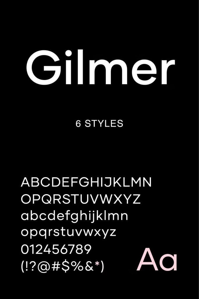
Gilmer features a large x-height, which improves legibility across different sizes. This design choice makes the font especially effective for body text, as it allows readers to process information quickly and comfortably.
Sharp Edges for a Clean Appearance
The typeface uses sharp, well-defined edges to create a crisp and modern look. These details give Gilmer a strong visual presence while maintaining clarity and precision in every letter.
Minimal Stroke Contrast for Consistency
Gilmer follows the neo-grotesk tradition by using very little stroke contrast. This approach ensures uniformity across all characters, resulting in a smooth and consistent reading experience. It also enhances the font’s performance in both print and digital environments.
Versatility Across Multiple Design Applications
Gilmer adapts effortlessly to a wide range of creative projects. Its clean and neutral design allows it to fit into various styles, from minimalist layouts to more complex compositions. Designers can rely on this flexibility to maintain consistency while exploring different visual directions.
- Magazine layouts and editorial design
- Posters and promotional materials
- Branding and logo development
- Website design and user interfaces
- Social media graphics and digital campaigns
By adjusting weight, spacing, and hierarchy, designers can use Gilmer for both subtle text elements and bold visual statements.
Designed for Both Print and Digital Use
Gilmer performs exceptionally well across different mediums. Its geometric structure ensures clarity in printed materials, while its clean lines and balanced proportions translate perfectly to screens. This makes it an ideal choice for designers working across multiple platforms.
Whether you are designing a magazine spread or a responsive website, Gilmer maintains its readability and visual appeal. Its adaptability ensures consistent results regardless of format or scale.
Perfect for Modern Branding
In branding projects, typography plays a critical role in shaping identity. Gilmer provides a neutral yet distinctive foundation that allows brands to communicate professionalism and clarity. Its geometric design conveys stability and precision, making it suitable for a wide range of industries.
Designers can pair Gilmer with other typefaces or use it as a standalone font to create cohesive and recognizable brand systems. Its versatility supports both bold and minimal branding approaches.
Why Choose Gilmer Font Family?
Gilmer offers a combination of classic inspiration and modern functionality that makes it a valuable addition to any designer’s toolkit. It delivers consistent performance while allowing for creative flexibility.
- Inspired by iconic geometric sans serif typefaces
- High x-height for improved readability
- Clean, sharp edges for a modern look
- Minimal stroke contrast for consistency
- Versatile across print and digital applications
This balance ensures that your designs remain clear, professional, and visually engaging.
Conclusion
Gilmer is a modern geometric sans serif font family that combines timeless design principles with contemporary performance. Its structured letterforms, high readability, and versatile nature make it an excellent choice for a wide range of creative projects. Whether you are designing for print, digital, or branding purposes, Gilmer provides the clarity and flexibility needed to create impactful and effective typography.