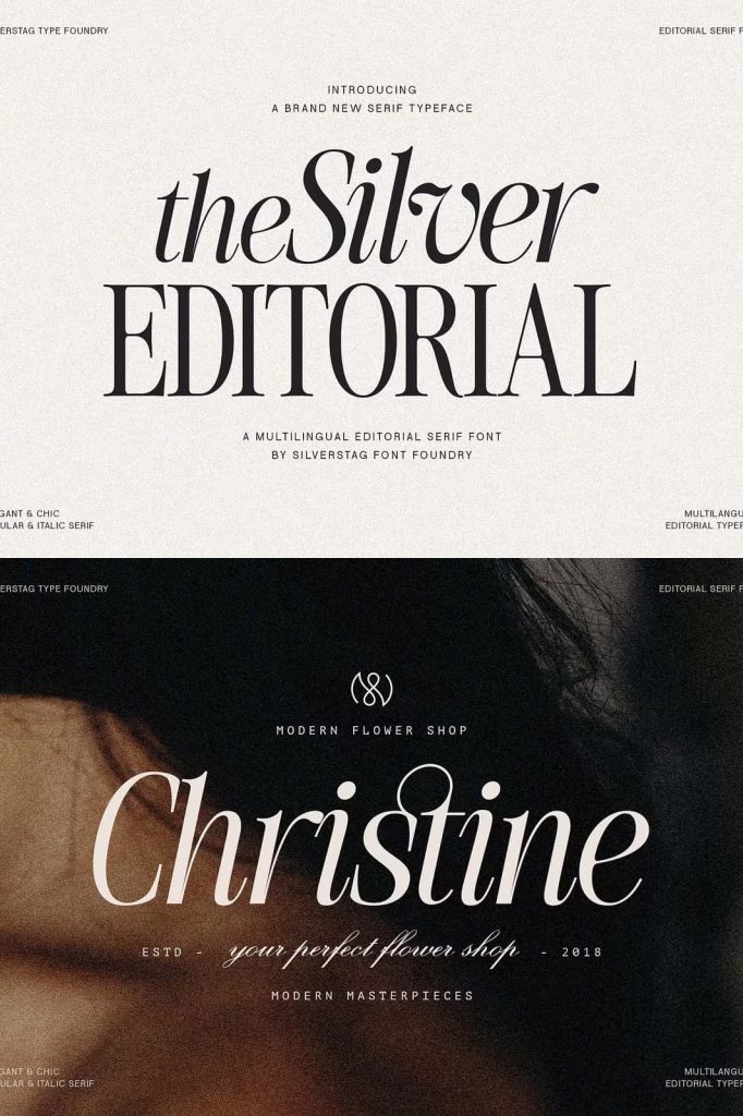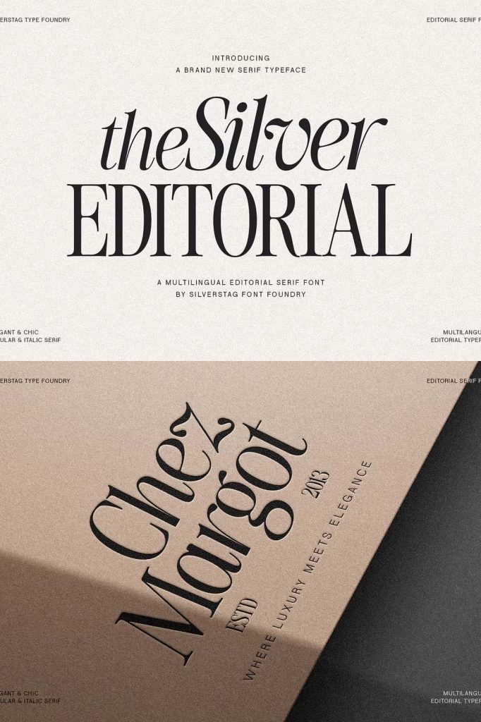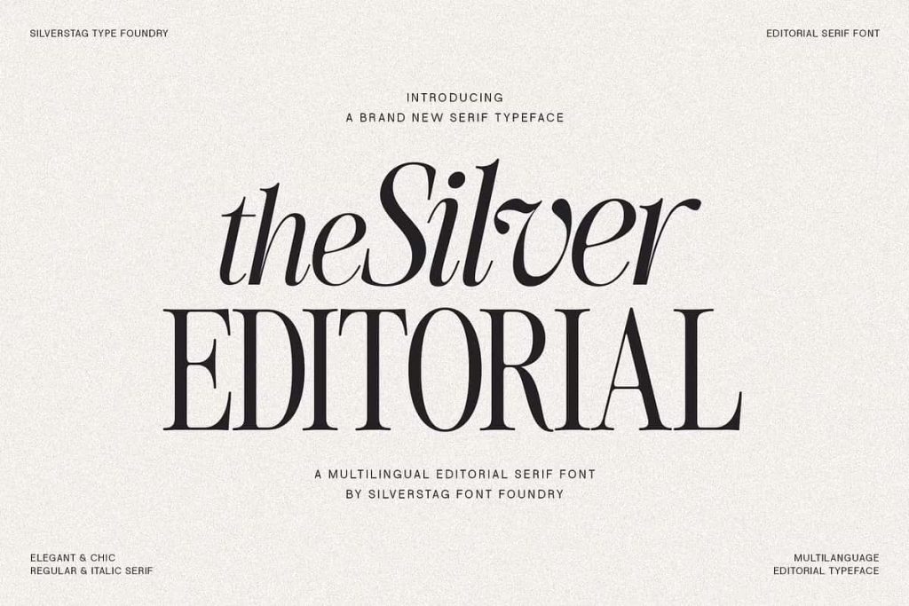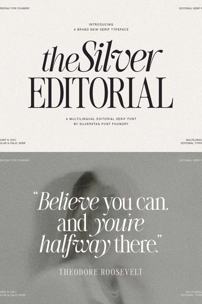
The Silver Editorial Serif Font: A Modern Take on Classic 1980s Typography
The Silver Editorial Serif Font represents a refined balance between tradition and innovation. Designed with a deep appreciation for classic typography, this typeface draws inspiration from the iconic editorial serifs of the 1980s while introducing a fresh, modern perspective. It allows designers to create work that feels both familiar and distinctive, combining timeless structure with contemporary energy.
As a result, The Silver Editorial stands out as a versatile and expressive font that adapts effortlessly to a wide range of creative projects. Whether you are designing editorial layouts, branding systems, or digital content, this typeface provides the tools to communicate with clarity, sophistication, and style.
A Balance Between Familiar and Unexpected
The Silver Editorial achieves a unique design balance by blending recognizable serif characteristics with subtle modern refinements. It respects the traditions of classic typography while introducing unexpected details that elevate its visual impact.
This combination allows designers to create compositions that feel grounded yet innovative. Instead of relying solely on nostalgia, the font transforms classic influences into something new and engaging.
Inspired by Iconic 1980s Editorial Design
The 1980s marked a significant era in editorial typography, characterized by bold layouts, structured letterforms, and strong visual hierarchy. The Silver Editorial captures these defining qualities and reinterprets them for modern use.
Its design reflects the elegance and authority of traditional print media while adapting to the needs of contemporary design. This makes it particularly effective for projects that aim to evoke a sense of credibility and sophistication.
Refined Serif Details for Modern Use
The Silver Editorial features carefully crafted letterforms that emphasize both beauty and functionality. Each character has been designed to ensure readability while maintaining a distinctive personality.
Elegant Proportions for Visual Harmony
The font uses balanced proportions to create a harmonious appearance across different text sizes. This ensures that it performs well in both headlines and body text, providing flexibility for designers.
Subtle Contrast for Clarity
The controlled contrast between thick and thin strokes enhances readability without sacrificing style. This approach allows the font to maintain a clean and modern look while preserving its classic roots.
Distinctive Details for Character
Small design nuances give The Silver Editorial its unique identity. These details add depth and interest, helping designs stand out while remaining cohesive and professional.
Perfect for Editorial and Branding Projects
The Silver Editorial excels in applications that require a strong typographic presence. Its refined style and versatility make it suitable for a wide range of creative uses.
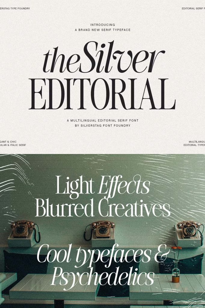
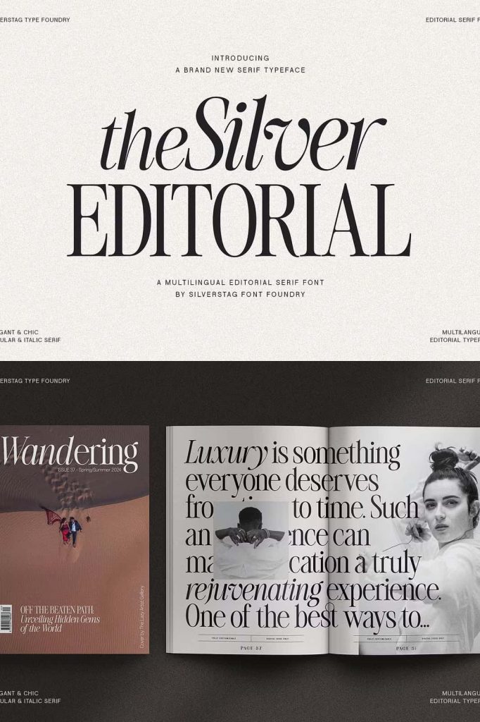
- Magazine layouts and editorial design
- Branding and logo development
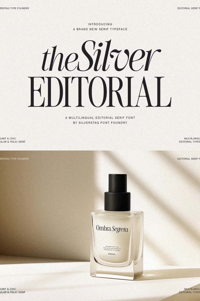
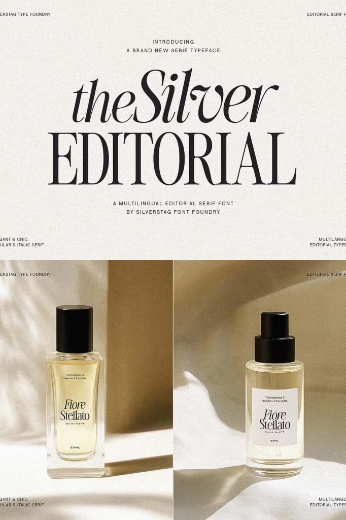
- Luxury packaging and product design
- Website typography and digital interfaces
- Marketing materials and promotional content
Designers can use this typeface to create polished and engaging visuals that communicate professionalism and creativity.
Versatility Across Print and Digital Media
The Silver Editorial performs consistently across different mediums. Its structure ensures clarity in print, while its refined details translate beautifully to digital screens. This adaptability makes it a reliable choice for designers working on multi-platform projects.
By adjusting scale, spacing, and layout, you can create a wide range of visual styles—from bold and dramatic to subtle and elegant. This flexibility allows the font to adapt to different creative directions without losing its identity.
Designed for Creative Exploration
The Silver Editorial encourages designers to experiment with typography while maintaining a strong foundation. Its balanced design allows you to push creative boundaries without compromising readability or structure.
Pair it with modern sans-serif fonts to create contrast, or use it as a standalone typeface for a cohesive editorial look. Its adaptability makes it suitable for both minimalist and highly detailed compositions.
Why Choose The Silver Editorial Serif Font?
Designers choose The Silver Editorial because it offers a unique combination of classic inspiration and modern performance. It delivers both aesthetic appeal and practical functionality.
- Inspired by iconic 1980s editorial typography
- Balanced design with modern refinements
- Excellent readability across different sizes
- Versatile for both print and digital use
- Strong visual identity for branding and editorial work
This combination ensures that your designs remain timeless, professional, and visually engaging.
Conclusion
The Silver Editorial Serif Font successfully bridges the gap between past and present. It captures the essence of classic 1980s typography while introducing a modern spirit that meets today’s design standards. With its refined details, versatile performance, and distinctive character, this typeface empowers designers to create impactful and memorable work across a wide range of applications.