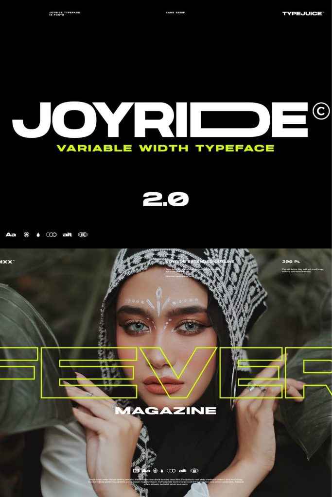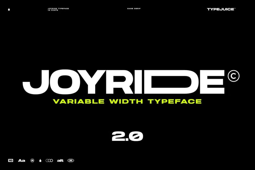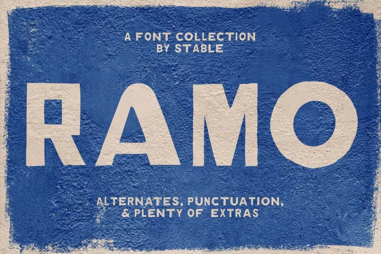
Joyride Variable Width Sans Serif Typeface: Dynamic Control for Modern Typography
Joyride is a variable width sans serif typeface that pushes the boundaries of modern typography through flexibility, precision, and creative freedom. Designed for designers who demand control and adaptability, Joyride introduces a dynamic system where width, weight, and style work together seamlessly. This typeface does not simply present letters; it gives designers the ability to shape and transform them to fit any visual concept.
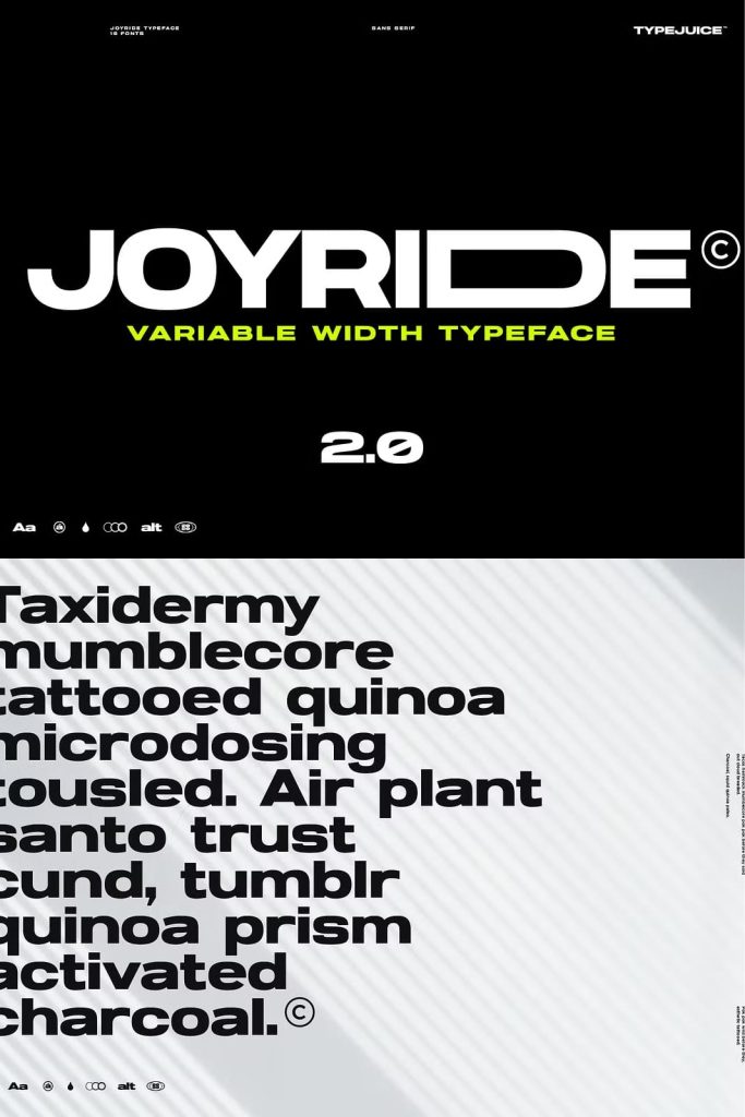
With a complete family of 16 fonts, Joyride offers a wide range of weights and styles that adapt to diverse design needs. From bold, attention-grabbing headlines to clean and structured layouts, this typeface performs with consistency and clarity. Its extended width system makes it especially powerful for creating unique compositions that stand out in competitive visual environments.
A Variable Width System Built for Flexibility
Joyride introduces a variable width approach that allows designers to adjust the proportions of each letter. This feature creates a new level of typographic control, enabling more expressive and customized layouts. Instead of relying on fixed structures, designers can expand or condense letterforms to match the tone and space of their design.
This flexibility enhances both functionality and creativity. Designers can maintain readability while experimenting with spacing and composition. The result is a typeface that adapts to both structured and experimental design approaches.
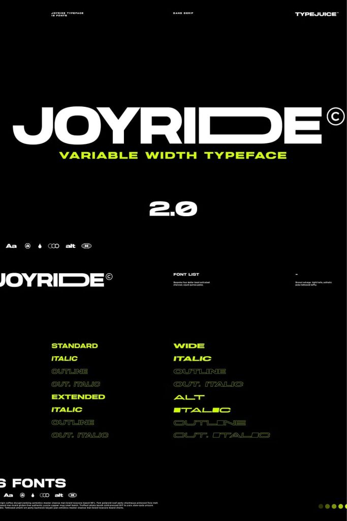
16 Fonts for Complete Design Coverage
The Joyride family includes 16 carefully crafted fonts that cover a broad spectrum of weights and styles. Each variation has been designed to work harmoniously with the others, allowing designers to build strong typographic hierarchies.
Light weights provide elegance and subtlety, while heavier styles deliver impact and boldness. This range ensures that Joyride can support everything from minimal layouts to high-energy visual designs. Designers can mix and match styles to create balanced and engaging compositions.
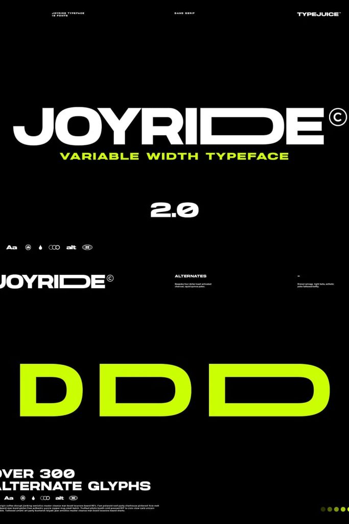
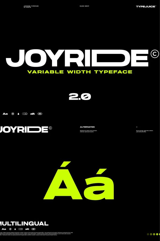
Over 300 Alternate Glyphs for Endless Customization
Joyride stands out with its extensive library of more than 300 alternate glyphs. These alternates give designers the freedom to explore different letterforms and create unique typographic identities. Each glyph variation offers subtle or dramatic changes that can completely transform the look of a word or phrase.
This feature makes Joyride especially valuable for branding and creative projects. Designers can craft distinctive logos, headlines, and visual elements that feel original and tailored. The variety of alternates ensures that no two designs need to look the same.
Creative Control Through Variable Width Alternates
The combination of alternate glyphs and variable widths unlocks a powerful level of creative control. Designers can adjust both the shape and proportion of letters, creating compositions that feel dynamic and intentional. This capability allows for precise alignment, improved spacing, and enhanced visual rhythm.
By experimenting with these features, designers can develop typography that responds directly to the needs of their project. Whether aiming for a bold statement or a refined aesthetic, Joyride provides the tools to achieve it.
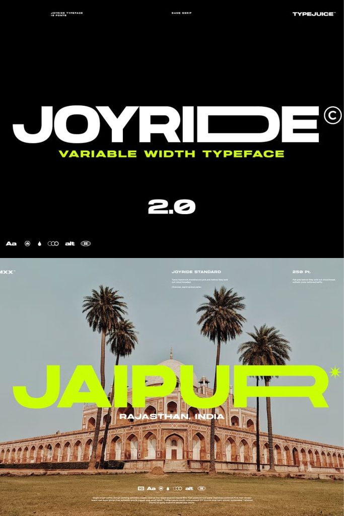
Perfect for Modern Branding and Digital Design
Joyride excels in branding projects where uniqueness and adaptability are essential. Its customizable nature allows brands to develop strong and memorable identities. The ability to modify widths and choose from a wide range of alternates helps create logos and visual systems that stand out.
In digital design, Joyride performs with clarity and precision. Its clean sans serif structure ensures readability across different screen sizes, while its flexible features allow designers to create engaging user interfaces and visual content.
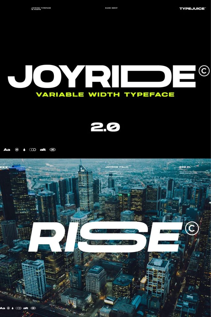
Ideal for Headlines, Layouts, and Creative Typography
Joyride works exceptionally well in headlines, where its adjustable widths and bold styles create strong visual impact. Designers can use it to craft eye-catching titles that immediately draw attention.
In layouts, the typeface supports structured compositions while allowing room for experimentation. It adapts to grids, asymmetrical designs, and typography-driven visuals. This versatility makes it suitable for editorial design, advertising, and digital campaigns.
Precision Craftsmanship Meets Innovation
Every detail in Joyride reflects careful design and technical precision. The spacing, proportions, and transitions between styles have been refined to ensure consistency across the entire family. This attention to detail allows the typeface to perform reliably in both large-scale and detailed applications.
Joyride combines traditional typographic principles with modern innovation. It respects the fundamentals of readability while introducing new possibilities for creative expression. Designers can rely on it to deliver both performance and originality.
Conclusion
Joyride variable width sans serif typeface offers a powerful combination of flexibility, customization, and modern design. With 16 fonts, over 300 alternate glyphs, and a dynamic width system, it provides unmatched creative control. Designers can use Joyride to build distinctive branding, engaging layouts, and expressive typography that stands out in any medium.