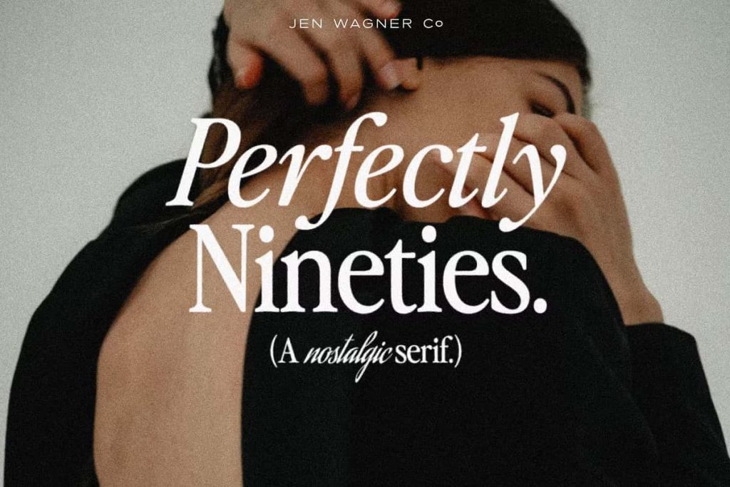
Perfectly Nineties Serif: A Nostalgic Typeface Inspired by Retro Typography
Perfectly Nineties is a fresh serif typeface that captures the unmistakable charm of 80s and 90s design. It brings back the tightly spaced, classic serif styles that once defined an era of bold editorial layouts and memorable branding. This typeface revives those nostalgic vibes while adapting them for modern creative use, making it an essential choice for designers who want to blend retro inspiration with contemporary execution.
Reviving the Iconic Style of the 80s and 90s
Design trends often come full circle, and serif typography from the late 20th century has made a strong return. Perfectly Nineties embraces this movement by reinterpreting the defining characteristics of that era. It features structured letterforms, confident spacing, and a timeless aesthetic that immediately evokes familiarity.
Instead of simply replicating the past, this typeface refines and modernizes those elements. Designers can now access a font that feels nostalgic without appearing outdated. It delivers a clean and polished result while maintaining the personality that made retro serif fonts so iconic.
Balanced for Both Display and Body Text
Perfectly Nineties offers exceptional flexibility across different design contexts. It performs equally well in large display settings and smaller body text, giving designers the freedom to maintain consistency throughout their projects.
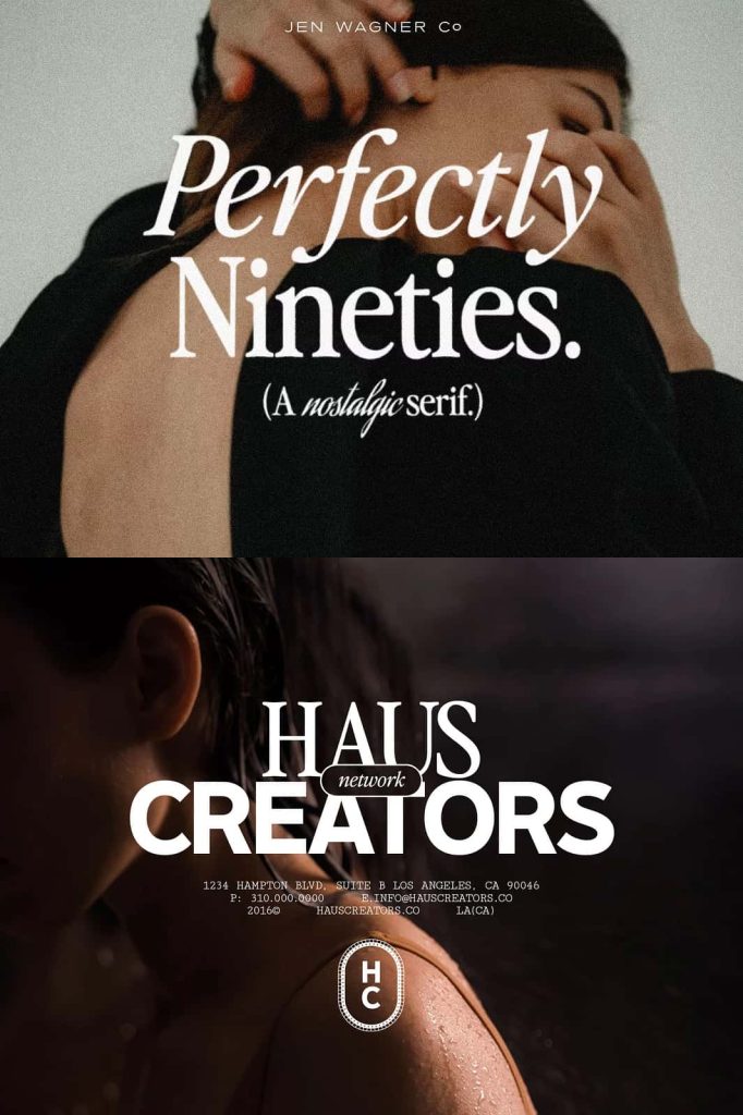
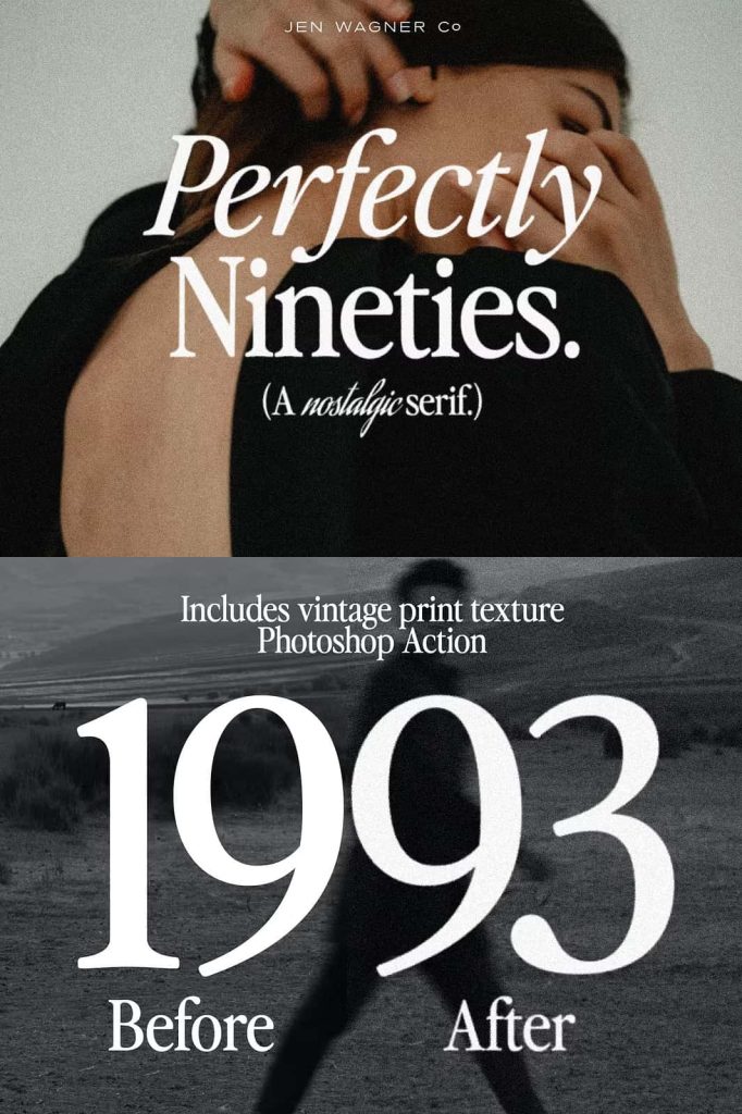
Strong Impact in Display Use
When used in headlines, titles, or branding elements, the font immediately commands attention. Its bold structure and tight spacing create a confident visual presence that stands out without overwhelming the design. This makes it perfect for posters, magazine covers, and logo design.
Clarity and Readability in Body Text
Despite its strong personality, Perfectly Nineties maintains excellent readability in paragraph text. The balanced proportions and carefully designed letterforms ensure smooth reading experiences, even at smaller sizes. This versatility allows designers to use a single typeface across multiple content layers.
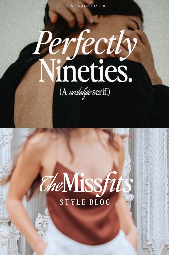
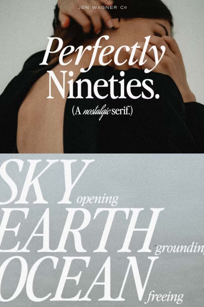
Uppercase and Lowercase Harmony
The typeface includes both uppercase and lowercase characters that work seamlessly together. Each letter complements the others, creating a cohesive and professional appearance. Designers can mix cases to create hierarchy, emphasis, and rhythm within their layouts.
This harmony enhances usability across various formats, from editorial spreads to digital interfaces. Instead of switching between multiple fonts, designers can rely on Perfectly Nineties to deliver consistency and style in every element.
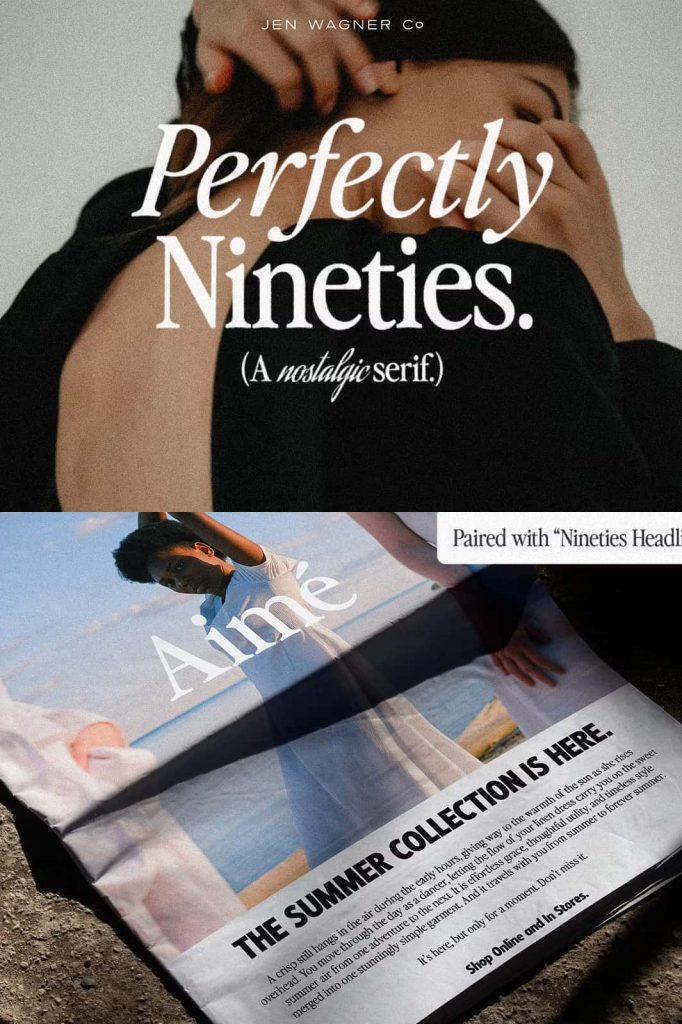
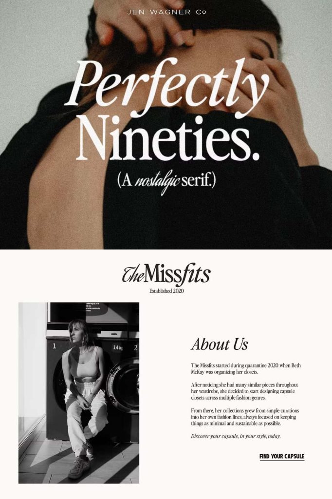
Ideal for Modern Retro Design Projects
Perfectly Nineties adapts effortlessly to a wide range of creative applications. Its nostalgic character makes it especially suitable for projects that aim to evoke emotion, memory, and authenticity.
- Editorial design and magazine layouts
- Branding and logo development
- Packaging with vintage inspiration
- Social media graphics with retro themes
- Website typography with a nostalgic twist
By adjusting spacing, scale, and composition, designers can create either bold retro statements or subtle vintage accents. This flexibility ensures the font remains relevant across different styles and industries.
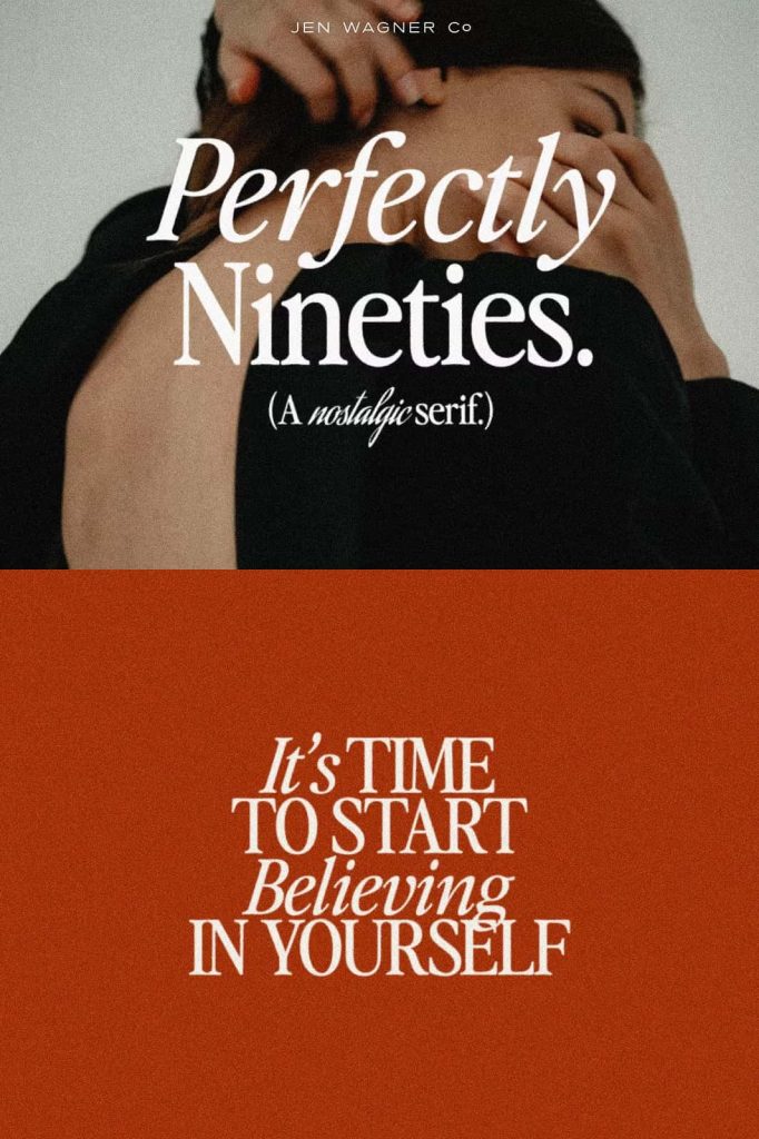
Designed for Creative Freedom
Perfectly Nineties empowers designers to explore new ideas while staying connected to classic design principles. Its structure encourages experimentation, allowing you to push creative boundaries without sacrificing clarity or balance.
Pair it with modern sans-serif fonts to create contrast, or use it as a standalone typeface for a cohesive retro aesthetic. Its adaptability makes it suitable for both print and digital platforms, ensuring consistent performance across all media.
Why Choose Perfectly Nineties Serif?
Perfectly Nineties offers a combination of nostalgia, versatility, and functionality that few typefaces achieve. Designers choose it for its ability to deliver both style and usability in a single package.
- Authentic retro-inspired serif design
- Excellent readability at all sizes
- Balanced uppercase and lowercase characters
- Strong visual impact for display use
- Flexible application across modern and vintage projects
By incorporating this typeface into your work, you can create designs that feel both familiar and fresh, connecting with audiences on a deeper level.
Conclusion
Perfectly Nineties is more than just a serif font—it is a celebration of timeless design. It captures the essence of 80s and 90s typography while delivering the performance needed for modern creative projects. Whether you aim to create bold headlines, elegant layouts, or nostalgic branding, this typeface provides the tools to bring your vision to life with clarity and character.