Portofino Gelateria Font Duo: A Nostalgic Italian-Inspired Typeface
Portofino Gelateria font duo captures the warmth and charm of a sunny seaside escape. This typeface brings to life the feeling of sitting in a cozy café by the coast, enjoying a refreshing treat while surrounded by vintage Italian signage and timeless design. It transforms that atmosphere into a visual language that feels both inviting and expressive.
Inspired by classic Italian posters, old shop signs, and elegant wedding menus, Portofino Gelateria delivers a rich sense of nostalgia. It allows designers to recreate the beauty of another era while maintaining a fresh and modern touch. The result is a font duo that feels authentic, emotional, and visually engaging.
A Hand-Drawn Typeface with True Character
Portofino Gelateria stands out because it embraces the imperfections of hand-drawn design. Each letter reflects the natural movement of the hand, creating a typeface full of personality. Instead of perfect symmetry, the font celebrates irregular lines, subtle variations, and organic curves.
These imperfections give the font its soul. They create a sense of authenticity that digital precision often lacks. Designers can use this quality to add warmth and individuality to their work, making every project feel more human and relatable.
Expressive Details That Add Depth
The small inconsistencies in stroke weight and spacing enhance the overall character of the font. These details bring depth and richness to the typography, allowing it to stand out without relying on heavy decoration. Each word feels crafted rather than generated, which adds emotional value to the design.
This expressive nature makes Portofino Gelateria ideal for storytelling through design. It helps convey mood, atmosphere, and personality in a way that feels natural and engaging.
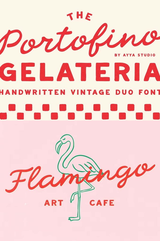
A Lively Script Paired with a Soft Sans Serif
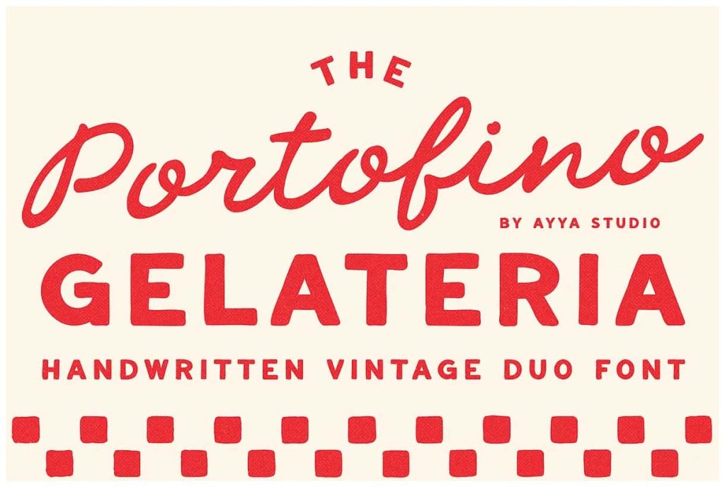
The font duo includes two complementary styles that work together seamlessly. The script font flows with energy and elegance, while the sans serif provides a calm and balanced foundation. This pairing allows designers to create contrast and hierarchy within their layouts.
The script font features fluid strokes and playful movement. It captures attention quickly and adds a decorative touch to headlines, logos, and key elements. In contrast, the sans serif uses softer shapes and a slightly naive style to maintain readability and structure.
Create Harmony Through Contrast
By combining these two styles, you can achieve a harmonious balance between expression and clarity. Use the script to highlight important words or create visual interest, and rely on the sans serif for supporting text and information. This approach ensures that your design remains both attractive and functional.
The contrast between the lively script and the gentle sans serif also adds visual rhythm. It guides the viewer’s eye through the content while maintaining a cohesive look.
Inspired by Vintage Italian Design
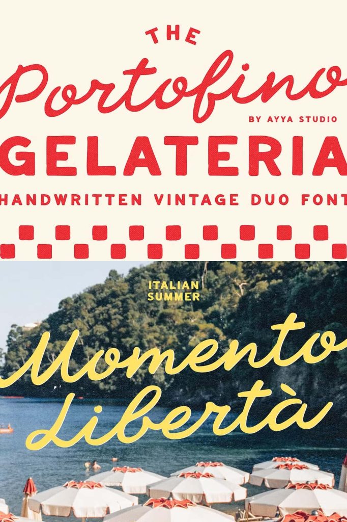
Portofino Gelateria draws inspiration from the golden era of Italian design. It reflects the aesthetic of traditional signage, handcrafted posters, and classic branding found in coastal towns. These influences give the font a timeless quality that resonates across different design styles.
The nostalgic feel of the font makes it perfect for projects that aim to evoke emotion and memory. It connects with audiences by reminding them of travel, culture, and simple pleasures. This emotional connection adds value to branding and storytelling.
Perfect for Elegant and Creative Projects
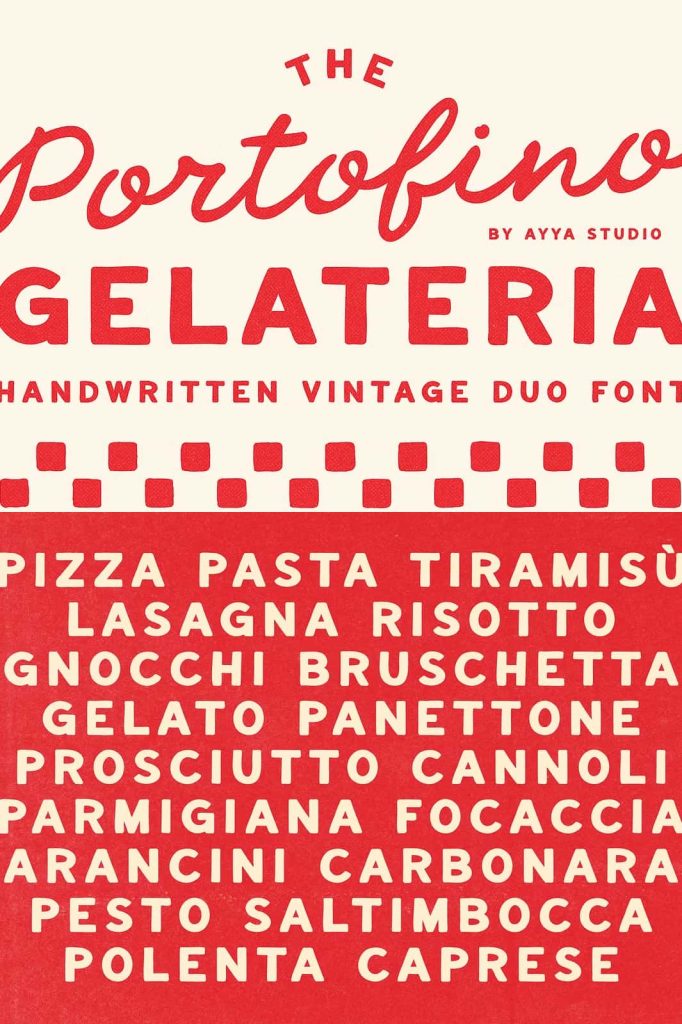
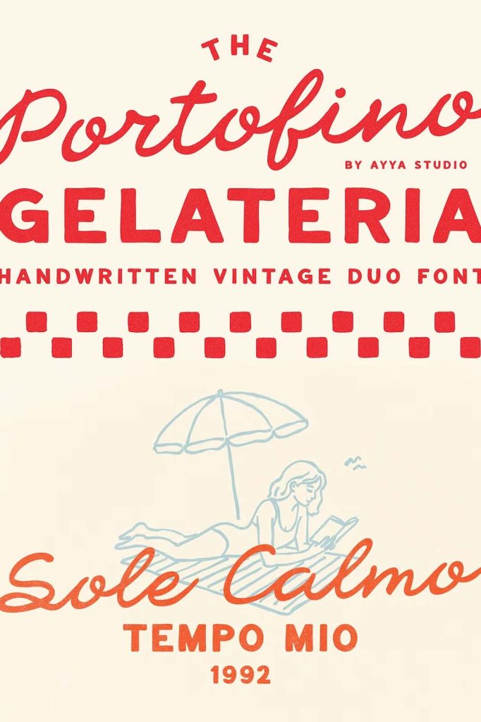
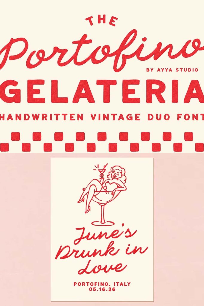
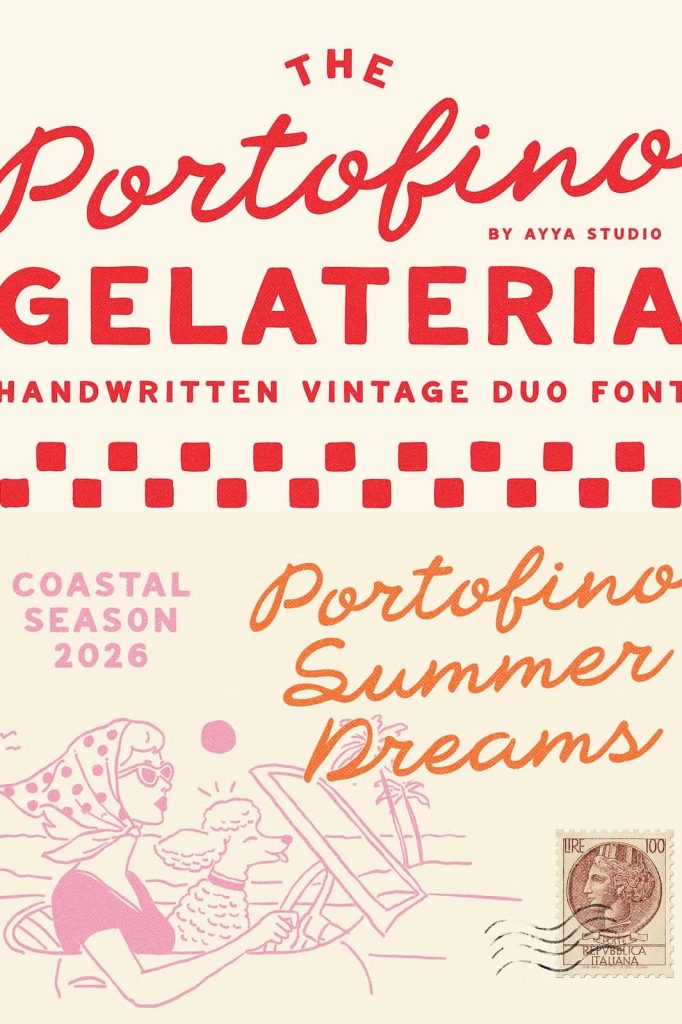
Designers can use Portofino Gelateria for a wide range of applications. It works beautifully for wedding invitations, restaurant branding, packaging, editorial layouts, and social media content. Its versatility allows it to adapt to both formal and casual settings.
The font duo enhances visual identity by adding a distinctive and memorable style. It helps brands communicate warmth, creativity, and authenticity in a way that feels effortless.
Versatility Across Print and Digital Media
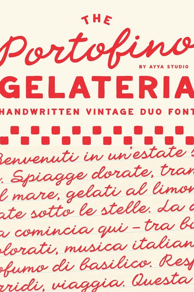
Portofino Gelateria performs well in both print and digital formats. Its hand-drawn quality remains clear and appealing across different sizes and resolutions. Whether used on a printed menu or a website header, the font maintains its charm and readability.
This adaptability makes it a reliable choice for designers who work across multiple platforms. It ensures consistency while still allowing room for creative exploration.
Build a Unique Visual Identity
With Portofino Gelateria, you can create a strong and recognizable visual identity. The font’s distinctive style helps your designs stand out while maintaining a cohesive look. It supports branding efforts by delivering a consistent tone and aesthetic.
By combining nostalgic inspiration with modern usability, this font duo gives you the tools to craft designs that feel both timeless and fresh.
Why Choose Portofino Gelateria Font Duo?
Portofino Gelateria font duo offers a perfect blend of personality, versatility, and emotional appeal. Its hand-drawn nature brings authenticity, while its thoughtful pairing of script and sans serif ensures balance and clarity.
Choosing this font means choosing a design approach that values character and storytelling. It allows you to create visuals that feel warm, inviting, and memorable. For designers who want to capture the charm of vintage Italian aesthetics, Portofino Gelateria delivers an exceptional and inspiring solution.